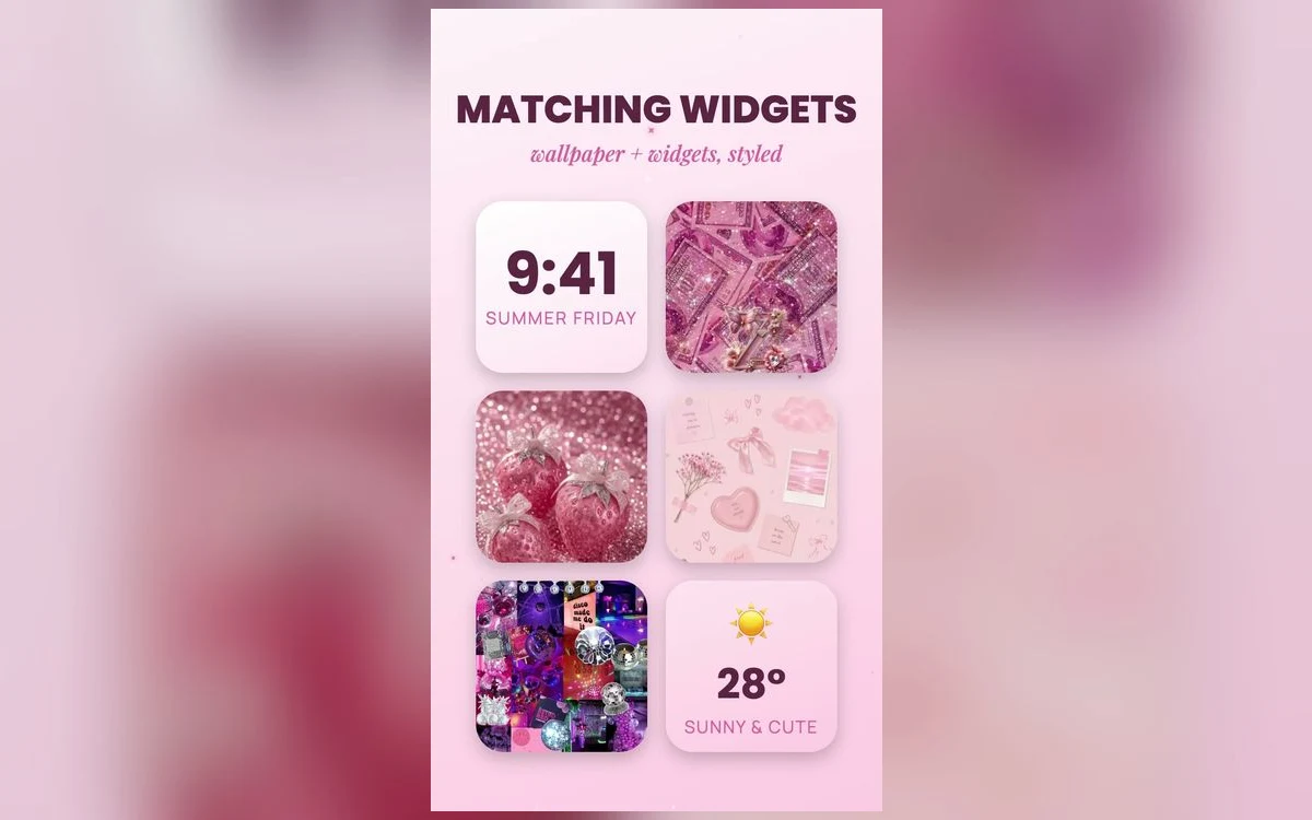
You spent an evening rebuilding the home screen. Matching widgets, one clean page, everything in the right color. It looked good for about four days.
Then you noticed you were opening the Weather app to check the weather, and Calendar to see what time the thing was, even though both were sitting right there in widget form.
That is the failure worth avoiding, and it is not about taste. A widget that tells you nothing is a picture taking up the space of several apps. Here is how to decide which ones deserve the room.
What a widget actually costs
On an iPhone home screen, a small widget occupies the space of four app icons. A medium one takes eight. A large one takes sixteen, which on most phones is a serious portion of a page.
That is the real price, and it makes the question simple. Does this tell you something you would otherwise open an app to learn, often enough to be worth four, eight or sixteen icons. A widget that passes is worth building a page around. One that fails is decoration you scroll past.
The widgets that earn their space
The pattern is the same across all of them: the information changes, and you want it before you have decided to do anything.
Weather qualifies, because the answer changes daily and you check it in passing. So does the next calendar event, which turns a question into a glance. A to-do list works if you genuinely keep one, since a list you never write to is a picture of an empty list. Battery levels earn their place when you carry AirPods, a watch or an iPad, because those are the batteries that surprise you. Since iOS 17, some widgets are interactive, so you can tick a reminder or toggle a light without opening anything, which is when a widget stops being a display and starts doing work.
The ones that look pretty and tell you nothing
The most common mistake is the widget that is really a launcher. A large photo tile that opens an app when tapped is doing the job of an icon at four times the size. If the only thing it adds is a bigger tap target, use the icon.
Clock widgets are the honest example. Your phone already shows the time at the top of the screen, so a clock widget is decoration, which is fine as long as you know that is what you are buying. Quote widgets sit in the same category, with the added problem that you stop reading them after a week. Keep one if you like it. Keep three and the page becomes a mood board you have to navigate around.
Keeping a pretty widget readable
Widgets are semi-transparent panels, and your wallpaper is underneath them. That is why a setup that looks fine in a screenshot can be hard to read in practice: a busy photo behind a widget puts detail directly under small text.
The fix is to think in layers. Keep the area under the widget row calm, whether that is a soft gradient, a wash of color or the quiet part of a photograph, and save the detail for the space around your icons. Sets built for phone layouts, such as those in Preppy Wallpaper: Pink Cute, tend to leave the top of the frame simple rather than filling every corner.
Run a one-week audit
Leave the setup alone for a week, then go widget by widget and ask one question: in the last seven days, did this ever tell me something without me opening the app. Anything that cannot answer yes is a launcher or an ornament. Move it to a second page, where it can be pretty without costing you the front row.
Stacks, and when rotation defeats the point
Dragging one widget onto another of the same size creates a stack you can swipe through, which is the tidiest way to keep several without giving up half a page. Stacks include options such as Smart Rotate, which lets iOS bring the one it thinks is relevant to the top, and suggestions, which can add widgets you did not choose.
Rotation is useful for things that matter at certain times, like a travel card in the morning. It is bad for the thing you check constantly, because now you have to swipe to find it. The rule: if you would be annoyed to look and see something else, give that widget its own slot.
Lock screen widgets do a different job
The lock screen holds a small row under the clock, with room for a handful of compact widgets, plus a slot above the clock on some layouts. Nothing there can show much, so the only candidates are the ones where a number or a single word is the whole answer: temperature, battery, next event, alarm time.
On iPhones with an always-on display, those widgets stay visible when the phone is idle, which makes an accurate one more valuable and a stale one more irritating. Recent iOS versions also let you change or remove the two shortcut buttons in the bottom corners, which used to be fixed to the flashlight and camera, though options depend on your version.
Quick answers
How do I add a widget to my iPhone home screen?
Touch and hold an empty part of the home screen until the icons jiggle, then tap the button in the corner to open the widget gallery and search for the app. Choose the size before adding it, then drag it into place. That button's wording has changed across iOS versions, but the gesture has not.
Why does my widget show old information?
Widgets do not run constantly. iOS schedules their updates through the day and spreads them out to protect battery life, so a widget can lag behind the app it belongs to. Low Power Mode and restricted background activity make that more noticeable. Opening the app usually forces a fresh look.
Do widgets drain the battery?
They use some power, since they wake to refresh, but the system limits how often that happens. A handful of widgets is not what empties your battery. Screen brightness and time with the display on matter far more.
How many widgets should one page have?
One or two on the main page, with the rest on a second page, is a workable pattern. Any page more than half widgets stops working as a launcher, which is what a home screen is mainly for.
Where to get it
If the wallpaper underneath is the part letting your setup down, Preppy Wallpaper: Pink Cute has free sets sized for iPhone, including plain and gradient backgrounds that sit under widgets without competing.
Build the page around the two widgets you actually read, and let everything else be decoration on purpose.