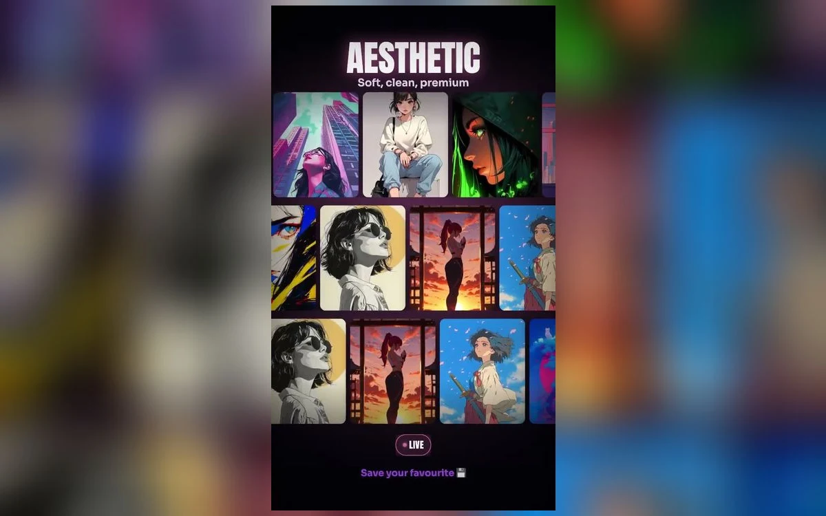
Almost every anime wallpaper you find has been prepared for a phone: tall, narrow, subject centred, space left at the top for a clock. On an iPad none of that applies. The screen is wider than it is tall most of the time, the lock screen clock sits in a different place, and the home screen is a much larger grid.
The result is that a wallpaper you love on your iPhone usually looks wrong on your iPad, and it is not your imagination.
Why the phone version does not transfer
A portrait image on a landscape screen has to be cropped inward, which means zooming in. You lose the edges and you magnify every flaw in the file. A composition built around a tall vertical subject becomes a close-up of that subject's middle.
The reverse also fails. A wide piece set on an iPad in portrait orientation gets cropped at the sides, and since most anime art puts the character in the centre with context around them, you lose the context and keep the figure floating.
The practical answer is to treat them as two separate wallpapers rather than one image used twice.
What to look for instead
Wide compositions with room around the subject. Landscape art, establishing shots, scenery pieces. The things that crop badly on a phone are often the things that work best here.
A subject that is off-centre. On an iPad the clock sits at the top, and the home screen icon grid covers a lot of the middle. Art with the figure to one side leaves the busy areas clear.
Scenery over portraits. This is the biggest single difference from phone wallpaper advice. A face needs to be large to read on a phone, and large faces on a tablet look overbearing. Landscapes, interiors and skies hold up at that size in a way portraits do not.
Genuinely large files. An iPad screen is far bigger than a phone screen, so an image that was adequate on a phone will be visibly stretched here. This is where undersized sources fail most obviously.
Orientation is the decision people skip
An iPad gets used both ways round, and the wallpaper has to survive both. iOS does not crop differently per orientation, it fits one image and lets the rest fall outside the frame.
So the test is simple. Set it, then rotate the iPad and look again. If the composition only works one way up, you will be irritated by it every time you turn the device.
Images that survive both tend to have a subject near the centre with tolerant, low-detail space around it: sky, water, mist, gradient. Anything where the framing is tight will fail one orientation.
The home screen grid is the real constraint
On a phone, blurring the home screen is usually enough, because the icons cover most of the screen anyway. An iPad home screen is mostly empty space with icons around the edges, so the wallpaper is genuinely visible and genuinely competing. That changes what works: a busy image that was fine behind a dense phone grid becomes noise here. Pick something quieter for the iPad home screen than you would for the phone, or blur it, which does more work on a large screen than a small one.
Live wallpapers and the iPad
Worth setting expectations. The moving wallpaper options on iPad are more limited than on iPhone, and what does move follows the same rule: nothing loops continuously in the background, and the home screen never animates.
In practice this means a still image is usually the better choice on a tablet, and the effort is better spent on finding a large, well-composed piece than on chasing motion.
Viewing distance changes what reads
A phone is held at arm's length and glanced at. An iPad is usually further away, propped on a desk or held in two hands, and it is looked at for longer.
That shifts what works. Bold, simple, high-contrast art is right for a phone because it has to register in a second. On a tablet you have time, so detail rewards you instead of overwhelming you: background architecture, crowd scenes, illustrated interiors, the kind of piece that is wasted on a small screen.
It also shifts what becomes tiring. An image with one loud focal point is fine for a glance and wearing over a long session. Something with an even spread of interest across the frame holds up better when the device is in front of you for an hour.
So the two devices genuinely want different pictures, and not only because of the shape. If you have ever wondered why a wallpaper you loved on your phone felt overbearing on the tablet, this is usually why.
Matching your phone without using the same file
If you want the two devices to feel like a set, match the palette rather than the picture. The same character in two different compositions, or two different pieces in the same colour range, reads as deliberate. The identical file cropped two ways reads as a compromise, because it is one.
A simple approach that works: a portrait on the phone, a scenery piece from the same series on the iPad, both blurred on the home screen.
Quick answers
Why does my iPad wallpaper look softer than the same file on my phone?
Because the display is larger. The same number of pixels spread over a bigger screen means less detail per inch, so an undersized file that passed on a phone will not pass here.
Can I have different wallpapers for lock and home screen on iPad?
Yes, the same Customise flow applies. Blur is usually the better home screen choice on a tablet, for the reason above.
Does the depth effect work on iPad?
It is more limited than on iPhone and depends on your iPadOS version and the image. Do not choose an iPad wallpaper on the assumption that depth will lift the subject.
Should I rotate wallpapers on a schedule?
Photo Shuffle works here too, but it is more noticeable on a large screen. If you use it, pick a set that shares a palette so the changes feel like variation rather than interruption.
Where to get it
Anime Wallpaper 4K – Live stores images at full size, which is what matters most on a tablet, and saves straight into Photos so nothing is lost to a re-download on the way.
Choose scenery for the iPad and portraits for the phone. That one rule fixes most of it.