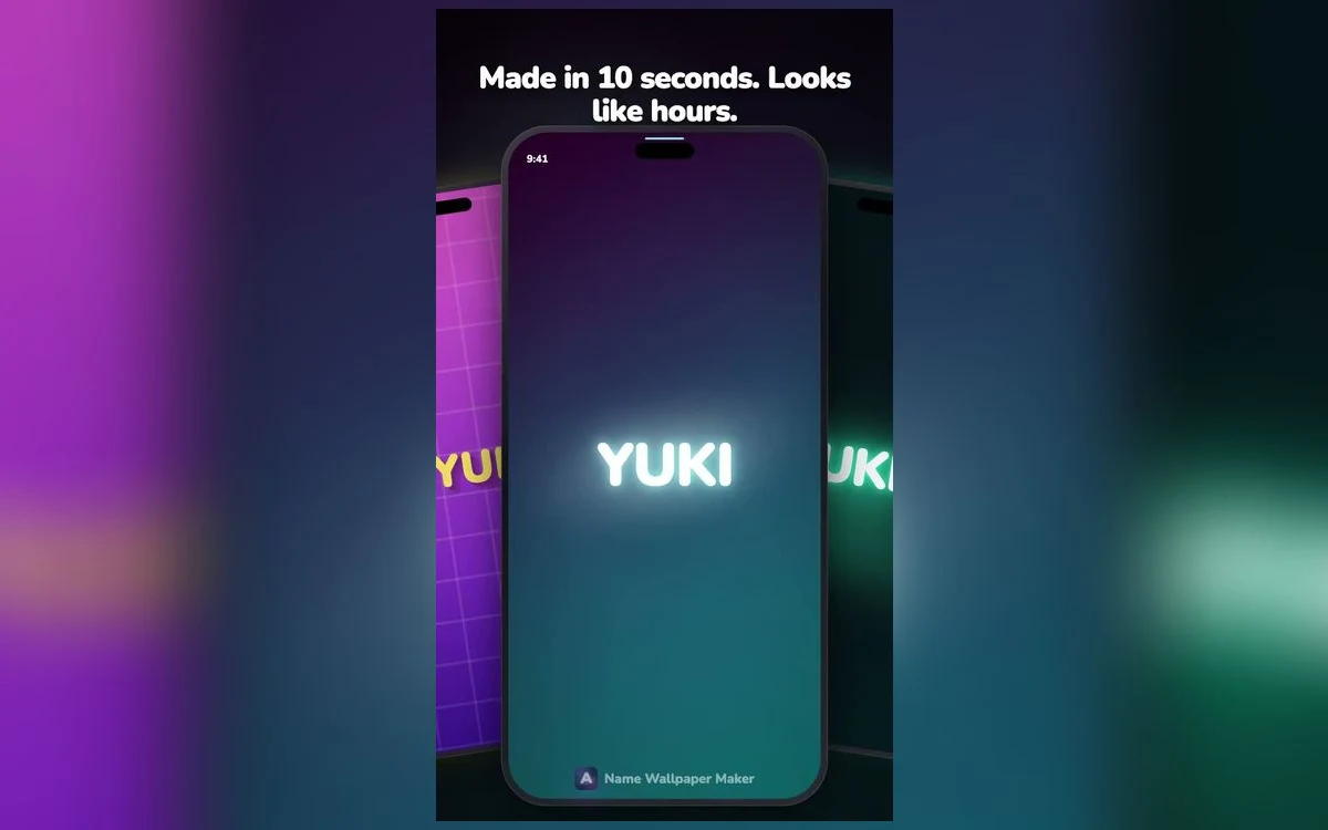
Scrolling a grid of wallpaper styles is a bad way to choose one, because every style looks good on the name the designer used to demo it. What matters is how it handles yours.
Here is what each of the popular looks is actually doing, and the kind of name it suits.
Marble and quiet luxury
Pale stone, fine veining, dark serif type. The whole effect depends on restraint — a lot of empty space and one line of text.
This style flatters short names and names with symmetrical letterforms. It is the most grown-up of the popular styles and the one that ages best; a marble lock screen looks the same in two years, where a trend-led style will not.
It is also the least forgiving of long names. Once the text has to shrink to fit, the elegance goes with it.
Chrome and gold plate
Metallic fills with a reflective gradient and a hard edge. High drama, high contrast.
Metal treatments need weight — they look best on bold, wide letterforms where there is enough surface for the gradient to move across. On thin type the metal effect has nowhere to live and reads as a grey outline.
Gold reads warm and celebratory; chrome reads cold and technical. Both are strong enough that they should be the only thing on the screen.
Vaporwave and gradient
Magenta-to-cyan gradients, grid horizons, a distinctly late-eighties palette.
This is the most forgiving style for long names, because the gradient carries the visual interest and the type can stay relatively simple. It is also the most dated-looking in the sense that it deliberately references a period — which is either the point or the problem, depending on your taste.
Try your actual name, not a demo
Every style looks good on a four-letter demo name. The real test is your own — especially if it is long, has repeated letters, or uses characters outside basic Latin. Ten seconds of typing tells you more than any gallery.
Minimal and thin
Hairline type, generous space, usually monochrome. The hardest style to get wrong and the hardest to make memorable.
Minimal works with any name length, which makes it the safe default. It also pairs best with a busy home screen — if your icons and widgets are colourful, a quiet lock screen is a relief rather than a missed opportunity.
The risk is blandness. Minimal only reads as designed when the spacing is deliberate; otherwise it reads as unfinished.
Retro 3D
Extruded letterforms, hard shadows, saturated colour. Playful and loud.
Best on short names and on names people already treat as a handle — gamer tags, nicknames, initials. It is the style that looks most like a logo, which is a compliment or a warning depending on what you want.
Script and signature
Handwriting letterforms, often with a glow or a thin stroke.
This is the most personal-looking style and the most dependent on the specific name. Scripts join letters, so names with awkward letter pairs can produce odd shapes. Try it and look closely at the joins before committing.
Choosing by name length
A rough guide that saves time.
Three to five letters — anything works. The heavy styles are where the drama is.
Six to eight letters — minimal, vapor, script. Avoid heavy metal treatments unless the letterforms are wide.
Nine or more — minimal thin, outline, or use a nickname instead. Long names in a heavy style always end up too small.
How style choice interacts with your wallpaper habit
People fall into two groups, and the right style is different for each.
Changers swap wallpapers every week or two. For them, trend-led styles are perfect — vaporwave, retro 3D, seasonal palettes. The style being of-the-moment is a feature, because the moment will have passed before the wallpaper does.
Setters choose once and keep it for months. For them, the quiet styles win. Marble, minimal and monochrome script still look considered a year later, where a loud style starts to feel like a phase.
Be honest about which you are. Most people who describe themselves as setters are actually changers, and pick something too safe as a result.
Reading a style at thumbnail size
A gallery shows you every style at postage-stamp size, and that view is misleading in a specific way: heavy, high-contrast designs look best in thumbnails and often worst at full size, where their weight becomes oppressive.
Minimal styles do the opposite. They look empty in a grid and come alive on an actual screen with actual space around them.
So when browsing, mentally discount the loud ones slightly and give the quiet ones more credit than the thumbnail suggests. Then preview your real name in both before deciding.
Colour psychology, briefly and without the mysticism
Colour does affect how a design reads, but not in the fortune-telling sense.
Warm palettes — gold, magenta, coral — feel energetic and read as friendly. They suit names you want to feel approachable.
Cool palettes — cyan, violet, silver — feel calm and technical. They suit shorter names and minimal layouts.
Monochrome — black, white, grey — feels deliberate. It is the palette that most reliably reads as designed rather than decorated, which is why it dominates in luxury branding.
None of this determines the right answer. It just explains why a style you liked in one colour feels wrong in another.
Quick answers
Which style is most popular?
Neon and vaporwave get the most attention, but marble and minimal are the ones people keep on their phone longest. Trend styles get replaced faster.
Can I change the colour within a style?
Most styles have several colourways. That matters more than it sounds — the same design in a different palette can suit a completely different person.
What if my name is very long?
Use a shortened version, initials, or a monogram. A five-letter version of a ten-letter name almost always looks better on a phone.
Do these work on Android?
The wallpapers are just images, so they work anywhere. The app itself is iOS.
Where to get it
Name Wallpaper Maker: Neon lets you type once and preview every style, which is the only reliable way to pick. Free to start, no account.
Try three styles you would not normally choose. One of them usually wins.