You have seen a name wallpaper you liked, tried the same style with your own name, and it did not work. That is not a failure of taste. The example probably had four letters and yours has nine, or theirs was all soft curves and yours is full of hard angles.
Lettering is not decoration applied on top of a name. It interacts with the specific letters you are setting. A script that flows beautifully through Mia has to negotiate three ascenders and a descender in Christopher, and it will either squeeze them or collide them.
So the useful question is not which font is best. It is what your name needs. Once you can look at your own name and see its length, its shape and its awkward spots, choosing becomes quick.
Read your name before you pick anything
Count the letters. Under five and you have freedom, because almost any style can be set large with room to spare. Six to nine and you need to start caring about width. Ten or more and the style has to be efficient or the name will shrink until it stops being the subject of the screen.
Look at the vertical spread. Letters that rise above the middle, such as b, d, f, h, k, l and t, and letters that drop below it, such as g, j, p, q and y, give a name a jagged silhouette. Names made mostly of round middle height letters, like Anna or Emma, have a smooth low profile. Jagged names have more character in scripts. Smooth names look calm in almost anything.
Note the awkward pairs. Double letters, a capital followed by a tall letter, and any run of three or more straight strokes in a row are the places where a decorative style is most likely to break down. If your name has one of those, test it early rather than choosing a style on a preview of a different name.
Script: for names with flow, not for every name
Script is the default choice and it deserves its popularity. It is warm, it feels handwritten, and it makes a personal object feel personal.
It works best on short and medium names with a mix of round letters and one or two tall ones. It needs its connections to actually connect, so keep letter spacing tight and resist the urge to add a glow around it, which fills in the small gaps inside loops and turns the word into a smear.
It struggles with all caps, with long names, and with names containing several capitals such as hyphenated or McSomething forms. Script capitals are large and ornate by design, and two of them in one word compete.
One practical detail: many scripts have long entry and exit strokes on the first and last letters. Those strokes need horizontal room. If your name already fills the width, the flourish gets cropped at the screen edge and the whole thing looks like an accident.
Serif: weight and formality without effort
A serif face, the kind with small finishing strokes on the ends of letters, is the quiet workhorse. It handles long names better than script because it does not need connections to work. It looks composed at any size and it ages well, which matters when you will see this screen constantly.
High contrast display serifs, with very thick stems and very thin hairlines, look expensive and suit surnames and formal treatments. They need size to work, because the thin parts vanish when scaled down.
Lower contrast serifs, closer to what a book is printed in, look sturdy and neutral. They are the right call when you want the name present but not performing.
Serifs also pair unusually well with metallic and marble treatments, because thick stems give a gradient somewhere to sit. If you want gold lettering and you are unsure of the face, a heavy serif is the reliable answer.
Test with the hardest version of your name
If you sometimes use a longer form, set that one first. Fitting Alexandra and then shortening to Alex is easy, because the shorter version will have space to spare in a layout that already accommodated the longer one. Doing it the other way round means discovering at the last step that the style you chose cannot hold the letters you actually want. The same applies to names with accents, which need vertical room above the letters that a tightly cropped layout may not have.
Condensed and all caps: the answer for long names
Condensed lettering is narrow by design. Each letter takes less horizontal space without getting shorter, which is exactly what a long name needs. A twelve letter name in a condensed face can be set large and still fit, where the same name in a normal width face would have to shrink noticeably.
Set in all caps with slightly widened spacing, condensed lettering looks modern and deliberate, closer to a poster than a signature. It suits surnames, single word marks and anything you want to feel confident rather than soft.
The trade off is warmth. Condensed caps are impersonal by nature. That is perfect for some people and completely wrong for a gift or a child's phone.
If you want the space efficiency without the coldness, condensed lower case with a capital first letter is a good middle ground. It reads as a name rather than a headline.
Hairline and thin: beautiful, and easy to lose
Very thin lettering looks refined and modern and gives a screen a lot of air. It also has the least margin for error of any style, because everything that goes wrong with thin type goes wrong at once.
It disappears on busy backgrounds. It disappears at small sizes. It disappears when the screen is dimmed, when the always on display is active on iPhones that have it, and outdoors in bright light where the screen's own contrast drops. A hairline name that looks perfect indoors can be genuinely invisible on a sunny street.
If you want thin lettering, protect it. Use a plain dark or plain light background with no texture behind the word, set it larger than feels necessary, and increase the letter spacing so the strokes are not fighting each other. Then look at it outdoors before deciding.
Matching lettering to what the screen is for
A lock screen you glance at all day should be easy on the eye. Very ornate lettering can be tiring in that role, in a way that is hard to predict from a single look. Calm styles tend to survive daily use better.
A screen that exists to be shown to people, or a gift, can be more expressive, because the moment of seeing it matters more than the hundredth glance.
A phone that needs to be identifiable in a pile of phones wants clarity above everything: bold, high contrast, readable from a metre away. Elegance is not the goal there.
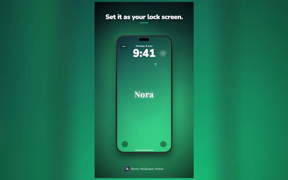
Name Wallpaper Maker: Neon lets you type the name once and step through script, serif, condensed and thin treatments without retyping, which is the fastest way to find out which of these your own name actually wants.
Quick answers
What is the safest choice if I cannot decide?
A medium weight serif, lower case with a capital first letter, in white or cream on a dark background. It fits almost any name length, stays readable in every lighting condition, and does not date quickly.
Can I mix two styles in one wallpaper?
Yes, and it works well for a first and last name: script for the first, plain caps for the second, or the reverse. Keep it to two, and make one clearly larger than the other so there is no question which is the main element.
How large should the name be?
Large enough to be the obvious subject and small enough to leave a clear margin on both sides. If the name touches the edges it reads as a banner. If it takes up less than about a third of the width it reads as a caption.
Does the lettering affect how the clock looks?
Indirectly. iOS offers the same clock fonts whatever the wallpaper, but the suggested colours are drawn from the image, and what it suggests can differ between iOS versions. What matters more is position: keep the name out of the clock's band so the two are not overlapping.
Where to get it
Name Wallpaper Maker: Neon covers the range described here, from script and heavy serif through condensed caps to minimal thin, with each style already sized and spaced for a phone screen. Find it on the App Store at on the App Store.
Set your name in three different styles, keep them all for a day, and the right one will be obvious by evening.