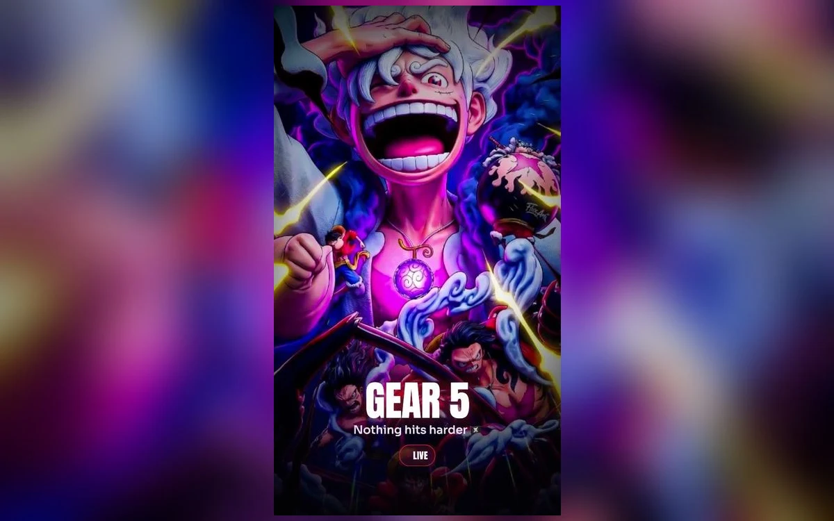
Gear 5 changed what a Luffy wallpaper looks like. The palette went white and pink, the linework went rubbery and cartoonish on purpose, and the backgrounds turned into clouds and lightning instead of open sea. That shift matters on a phone, because white-haired art on a bright background is the hardest thing to put behind an iPhone clock.
Here is how to make it work, and which Gear 5 compositions are worth setting at all.
Why Gear 5 art fights the lock screen
The Nika design is deliberately bright. White hair, white coat, pale skin, often on a pink or blue sky. A white clock over that is unreadable, and the default clock is white.
You have three ways out. Change the clock colour to a dark tone in the editor, which is the fastest fix and the one most people never try. Pick art with a dark upper third, which in Gear 5 usually means the storm-cloud pieces. Or pick a silhouette composition, where Luffy is backlit and reads as a dark shape against a bright sky.
The storm pieces are the sweet spot. The lightning gives you a bright focal point low in the frame and leaves dark cloud at the top for the time to sit on.
Gear 5 versus the earlier forms
Worth being honest about the trade. The straw-hat and Gear 4 art is easier to set: darker palette, red and blue rather than white and pink, more contrast to begin with. If you have tried three Gear 5 wallpapers and none of them looked right, the problem is probably the palette rather than the images.
Gear 5 pays off on the loud compositions specifically. The wide grin, the exaggerated proportions, the giant-scale panels. Those carry at a glance in a way a standard portrait does not, and a lock screen is looked at for about a second at a time.
The wider One Piece set, including Zoro, Ace and the crew pieces, is covered in the One Piece roundup.
Live versions and what iOS actually plays
Gear 5 suits motion better than most One Piece art, because the effects move rather than the character: lightning crossing the frame, clouds drifting, a pulse in the white glow.
Set expectations on iOS behaviour. Nothing on an iPhone lock screen loops continuously in the background. Motion happens at moments, on wake, on unlock, on tilt. A live Gear 5 wallpaper plays for a second or two and then holds still, which is correct rather than broken. On Pro models from iPhone 14 onward, the always-on display shows a dimmed static version while the phone is idle.
The home screen has never animated on iPhone, on any version. Live wallpaper is a lock screen decision only. Live versus static goes through when each is worth it.
Save it straight into Photos
The motion in a Live Photo lives in a second file paired with the still, and most ways of moving a picture around break that pairing. Chat apps, uploads and re-downloads, and editors that do not understand Live Photos all hand you back a flat image. Save from the wallpaper app directly to your library, then check the Live badge in Photos before setting it.
Depth effect on a Gear 5 portrait
Depth effect lifts the subject in front of the clock and it works well here when the composition is simple, because the silhouette is unmistakable: the hair shape, the hat, the coat line.
It fails on the panel-style and collage pieces, which Gear 5 art is full of. iOS needs one clear subject against a separable background, and a montage gives it nothing to isolate.
Two things disable it without warning. Widgets under the clock switch depth off on that lock screen. And when the subject covers too much of the time, iOS drops the effect rather than hiding the clock, so dragging the image down slightly often restores it. The full sequence is in the depth effect guide.
Reading it from a metre away
A lock screen is looked at in short glances, usually at arm's length, often in bad light. That is a harsher test than a wallpaper gallery, and it is where Gear 5 art splits into two groups.
The pieces that survive have one dominant shape. A single figure, a single burst of lightning, one strong diagonal. You recognise them before you have focused on them.
The pieces that fail are the detailed ones: many characters, small faces, fine linework across the whole frame. They reward looking closely, and nobody looks closely at a lock screen. Save those for the home screen behind a blur, where the colour carries and the detail is not the point.
A quick test before you commit. Set it, lock the phone, walk away, then wake it from a normal holding distance. If you cannot tell what you are looking at in the first moment, it is a gallery image rather than a wallpaper.
Pairing the home screen
A bright Gear 5 lock screen next to a default home screen looks accidental. In the editor, tap Customise, open the Home Screen panel and choose Blur. You keep the pink and white and lose the detail that makes app labels hard to read.
If you want the character on both screens, use a darker piece for the home screen rather than the same file. Icons sit better on cloud and lightning than on white coat and hair.
Quick answers
Why is the white hair blowing out on my screen?
Check whether the source is an upscale. Overexposed white on a large iPhone display usually means the original was smaller than the screen and iOS scaled it up. Start from an image at least as large as your display.
Can I have a Gear 5 screen and a normal one, and swap them?
Yes. Build more than one lock screen, then link each to a Focus. Touch and hold the lock screen while unlocked, tap plus for another, and attach a Focus in the editor.
My live wallpaper is not moving.
Check Reduce Motion in Settings, Accessibility, Motion, then check Low Power Mode. If both are off, open the picture in Photos and confirm the badge still reads Live rather than Off.
Does a bright wallpaper cost battery on an OLED iPhone?
More than a dark one, yes. Unlit pixels draw no power, so a mostly white wallpaper does use more than a mostly black one. Screen brightness and screen-on time still matter far more than the image.
Where to get it
Anime Wallpaper 4K – Live has a One Piece section covering Gear 5 alongside the earlier forms, in both still and live versions, previewed in a phone-shaped frame so you can see where the clock falls before saving.
Change the clock colour first. On Gear 5 art it decides how much of the collection is usable at all.