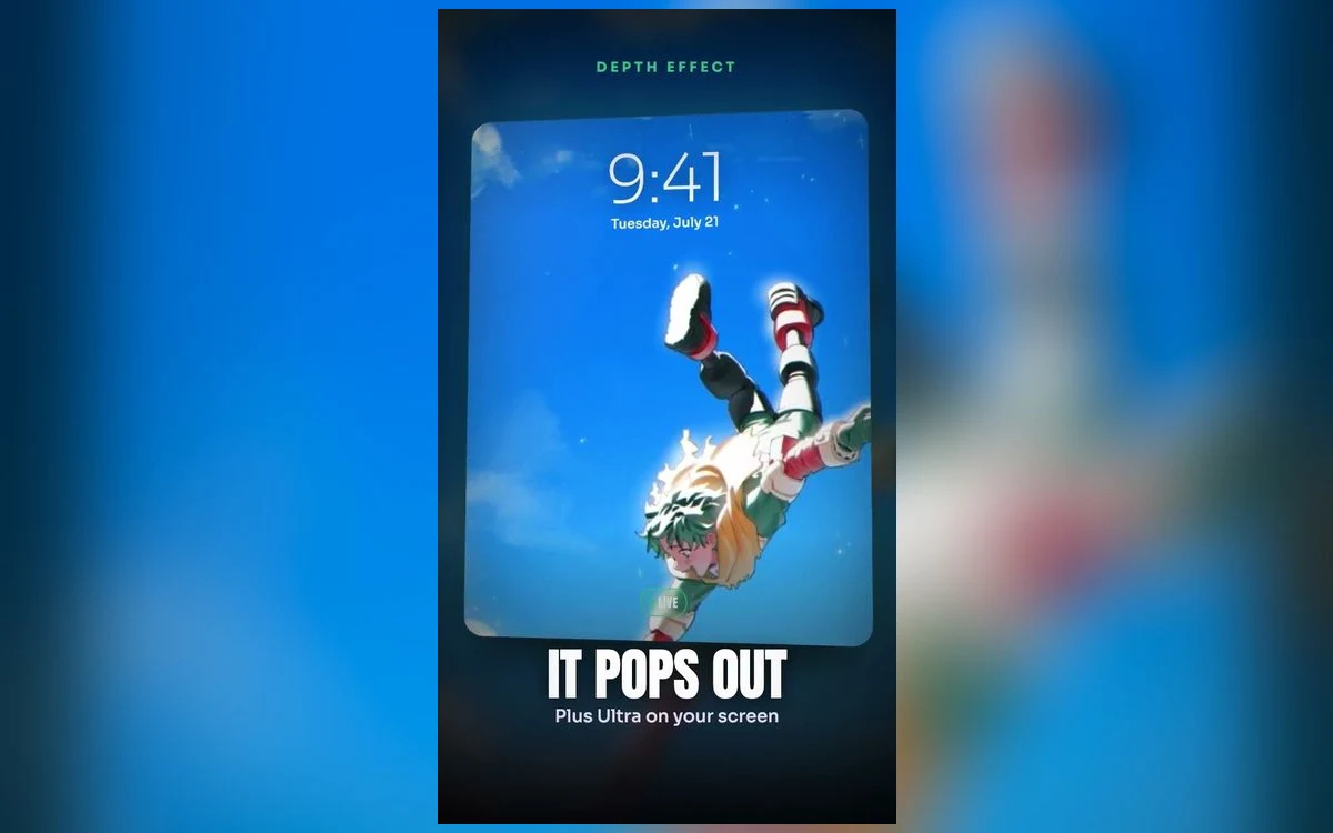
My Hero Academia is a bright series, and that is the whole problem. The costume designs are built from primary colours, the effect work is yellow-green lightning and orange fire, and most of the memorable art is set in daylight. All of which fights a white clock.
Here is how to get a My Hero lock screen that reads properly, and which characters give you the easiest time.
The palette problem, character by character
Deku's costume is green and black with white accents, which is the friendliest of the main cast. Dark green takes a white clock without complaint, and the One For All lightning gives you a bright focal point that can sit low in the frame.
Bakugo art is orange and black, high contrast by default, and usually explosive in the literal sense. That works, but the explosions tend to be composed at the top of the frame, right where the time goes. Look for pieces where the blast is at hand height rather than overhead.
Todoroki is the split case, half ice and half fire, and it is genuinely the hardest to set. The image is bright on one side and dark on the other, so the clock is legible over one half and invisible over the other. Pick a crop that puts the ice side under the time, or change the clock to a dark colour and use the fire side.
Shigaraki and the villain art is the easy answer if you want something that just works. Dark palettes, muted backgrounds, high contrast.
Change the clock before you change the wallpaper
The step almost nobody tries. Tap the time in the wallpaper editor and you get a font and colour picker. On the bright My Hero art, a deep charcoal or black clock is legible where white is not.
Do that once and a large part of the collection becomes usable. Judge images only after the clock is set, because a lot of the ones that look impossible at first are fine.
What the depth effect needs
Depth effect lifts the subject in front of the clock, and My Hero portraits are good candidates when they are simple: one character, clear silhouette, separable background. Deku's hair shape and Bakugo's gauntlets both read well as outlines.
It fails on the group art, and this series has a lot of it. Class 1-A line-ups, hero team compositions, anything with five faces. iOS needs one clear subject to lift, and a group gives it nothing to choose.
Two things turn it off without telling you. Adding widgets under the clock disables depth on that lock screen. And when the subject covers too much of the time, iOS drops the effect instead of hiding the clock, so dragging the image down a little often brings it back. The depth effect guide has the full sequence.
Bright wallpapers cost more on OLED
Every lit pixel draws power on an OLED iPhone, and black pixels draw none. A daylight My Hero wallpaper genuinely uses more than a dark one, and on the always-on display of a Pro model it is on screen far more of the time. Screen brightness and screen-on time still matter much more than the image, so this is a reason to prefer the darker art rather than a reason to avoid the series.
Live versions and what actually plays
My Hero suits motion, because the signature effects move: lightning crawling over Deku, sparks off Bakugo's palms, ice spreading.
What iOS does with it is narrower than the previews suggest. Nothing on an iPhone lock screen loops continuously in the background. Motion happens at moments, on wake, on unlock, on tilt. A live wallpaper plays for a second or two and then holds still, which is correct behaviour rather than a fault. On Pro models from iPhone 14 onward, the always-on display shows a dimmed static version while the phone is idle.
The home screen has never animated on iPhone, on any version, so this is a lock screen decision only. Live versus static covers when the motion is worth it.
Pairing the home screen
Bright, saturated wallpaper plus bright, saturated app icons is the combination that makes a phone look chaotic, and My Hero art walks straight into it.
Blur solves it. In the editor, tap Customise, open the Home Screen panel and choose Blur. You keep the green or the orange and lose the detail that fights with app labels.
If you want a second image rather than a blur, take a darker piece from the villain side. The pair still reads as the same series and the icons stay legible.
Quick answers
Why does the lightning look banded on my screen?
Compression. Fine gradient effects like lightning and fire are the first thing a re-saved file loses, and it shows as visible steps in the glow. Start from a large original rather than a screenshot.
Can I set a different character for different times of day?
Yes. Build more than one lock screen and link each to a Focus. Touch and hold the lock screen while unlocked, tap plus to add another, and attach a Focus in the editor.
Is there a version that works with the always-on display?
Any of them will show, dimmed and static. Dark art looks considerably better in that state than daylight art, so if you use always-on, that alone is a reason to pick the darker pieces.
The colours look different from the preview.
True Tone and Night Shift both warm the display, which shifts the greens and oranges noticeably. Check the wallpaper once in a neutral light before deciding.
Where to get it
Anime Wallpaper 4K – Live has a My Hero Academia section in both still and live form, previewed in a phone-shaped frame so you can see where the clock lands before you save anything.
Set the clock colour first. On this series it decides how much of the collection you can actually use.