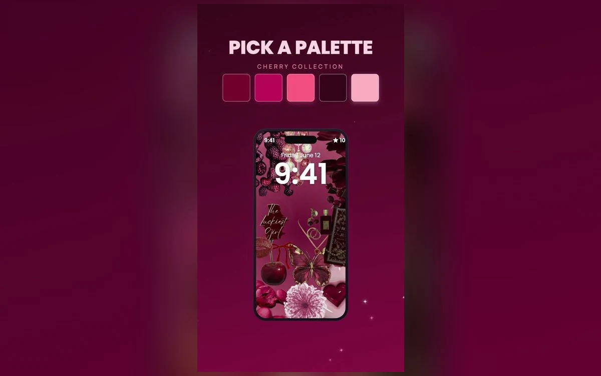
You saw a cherry red wallpaper on someone else's phone and it looked calm. Then you went searching for red wallpapers yourself and got fire engines. Bright, flat, loud, the sort of red that makes every app icon look like it is shouting over the top of it.
The difference is not the shade of red. It is how much red there is, and what sits behind it.
Cherry works because it is a small amount of deep red resting on a warm off-white. Get that balance right and the red behaves like an accent. Get it wrong and no amount of pretty artwork will rescue the screen.
Cherry is a ratio, not a colour swatch
Picture an actual cherry. A small dark red object with a lot of pale space around it. That is the whole formula, and it is the thing to check first when you are scrolling through options.
The useful question is not "is this red nice" but "how much of this picture is red". Keep the red as an accent rather than the ground and it stays readable; let it fill the frame and you have a red wallpaper, which is a different mood entirely and much harder to live with all day.
That is why cherry prints, little bows, small checks and scattered fruit motifs work so well on a phone. They break the red into small pieces with cream between them, so your eye has somewhere to rest between the loud bits.
Why cream calms red down and white does not
Pure white beside a saturated red gives you maximum contrast. The edges go sharp and, on a bright screen, the red can seem to buzz slightly. That is a poster effect, meant to be read across a room, which is not how anyone uses a phone.
Cream is white with a little yellow in it, so it sits in the same warm family as red. The step between the two colours is smaller, and the image reads as one palette instead of two colours arguing. It is also kinder at night, when a full-white background can be genuinely unpleasant at low brightness.
If you want the red quieter still, look for shades that are deepened rather than brightened: burgundy, oxblood, a red with some brown in it. Deep red on cream is the version you keep. Bright red on stark white is the version you change after three days.
Keep the busy part below the clock
On the lock screen the clock sits high, with the date above it and, on recent iOS versions, a row of small widgets underneath. That top strip is where most cherry wallpapers fall apart, because a cluster of small red shapes behind a large clock makes both harder to read.
Solid colour behind the clock is fine, even a deep red one. Detail is the problem, not darkness. A repeating pattern of little cherries directly behind the numerals turns the whole area into noise.
Crop it before you commit
When you set a photo as your wallpaper you can pinch to zoom and drag it before saving, instead of accepting the default crop. Push the busiest cluster of red toward the middle or lower third so the clock sits over plain cream. The clock stays visible while you drag, so you see the result you are choosing rather than discovering it afterwards.
Your home screen needs a quieter version
Lock screens can carry more pattern because nothing sits on top of them except the clock. Home screens cannot. You are adding several columns of app icons, and every one of them is a small coloured rectangle competing with whatever is behind it.
The practical move is to use two different cherry images rather than the same one twice. Something with a print for the lock screen, something closer to plain cream with red only near the edges for the home screen. If you would rather keep one image, iOS lets you blur the home screen version while you are setting the pair up, which softens the pattern into a wash of colour and leaves your icons legible.
Cherry has a specific advantage here. Cream is a light background, so dark app icons stay readable on it. Very dark wallpapers do the opposite and leave pale icons floating oddly.
What sits well next to cherry
Warm neutrals are the safe answer: cream, oat, butter yellow, soft brown, tan. They share the warmth, so nothing clashes.
Navy and deep green work as a second accent because they sit far enough from red on the colour wheel to look deliberate rather than accidental. Gingham and small checks in those colours are a preppy staple for that reason.
The pairing to avoid is neon pink. It is close to red in hue but much brighter, so the two read as a mistake rather than a palette. Pure black is the other one to watch, since it drains the warmth out of the cream and pushes the whole thing toward warning-sign territory.
Scrolling a large collection trains your eye faster than any rule. Preppy Wallpaper: Pink Cute groups its cherry designs together, and after a few minutes of swiping you start spotting the ratio problem before you tap anything.
Quick answers
Does a red wallpaper drain my battery faster?
On iPhones with OLED screens, black pixels are effectively switched off, which is where dark wallpapers save a little power. A cherry design is mostly cream, so it is a bright image and there is no saving to be had. The difference is small either way.
Why does my cherry wallpaper look orange sometimes?
True Tone adjusts the screen's white balance to match the light around you, and Night Shift warms the display on a schedule. Both can push a warm red toward orange, especially indoors in the evening. Either can be turned off in Settings under Display and Brightness.
How do I keep the clock readable on a busy wallpaper?
Move the pattern away from the top of the screen when you crop, then change the clock itself. On recent iOS versions you can tap the time while customising the lock screen and pick a different font, weight and colour, which usually rescues a marginal case.
What actually counts as a cherry aesthetic?
It is a palette rather than a single picture. Deep red on cream, small repeated motifs, bows, checks and fruit, usually with a slightly vintage feel. Actual cherries are common but not required.
Where to get it
You can browse cherry palette designs in Preppy Wallpaper: Pink Cute, sorted into palettes so the whole cherry family sits in one place instead of scattered through search results.
Pick one with plenty of cream in it, crop it carefully, and it will still look good in a month.