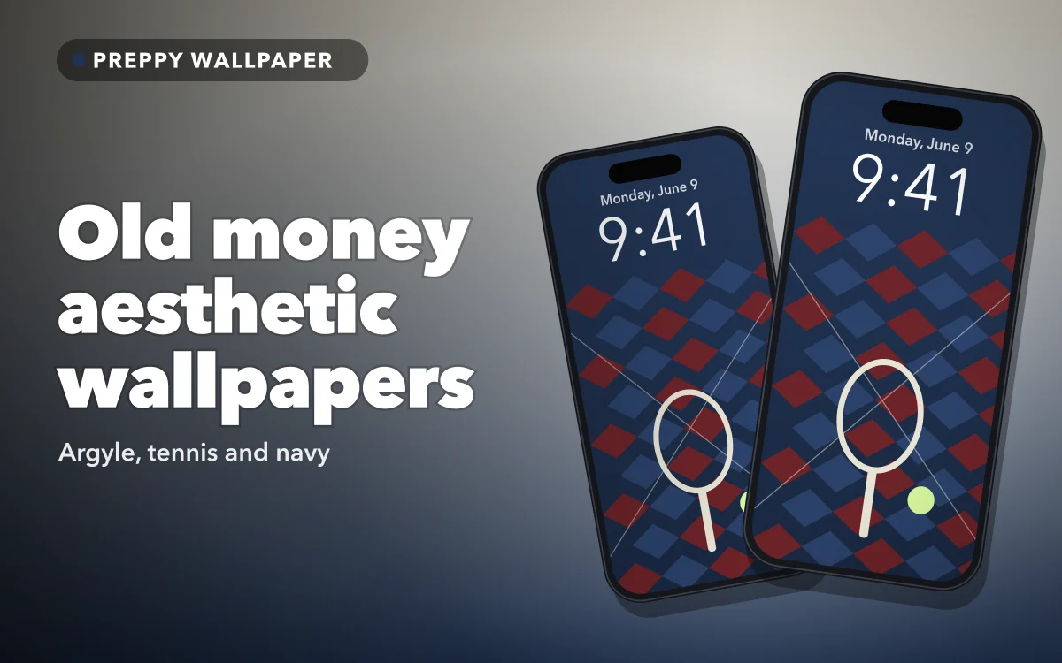
Search for an old money aesthetic wallpaper for iPhone and some results may be photographs of banknotes and coins. That is not what most people mean. On social media, "old money" is a style label for a restrained, heritage look: navy and cream, cable knits, argyle, tennis whites. It describes a mood, not anyone's actual family.
On a phone, that look has one advantage and one catch. Muted colours and quiet patterns sit behind a clock and a grid of icons better than almost anything bright. But the same soft palette that suits icons can make a white clock all but disappear.
What an old money aesthetic means on an iPhone wallpaper
On a lock screen the look comes down to three things: a muted palette, one classic motif, and plenty of space left alone. The fashion version is about fabric and fit. The phone version is about what survives at small size behind the time.
Restraint is the test. A good old money wallpaper has one idea in it — a single racket on a cream ground, argyle knit in close-up, a navy field with one thin stripe — rather than a collage. Logos and gold belong to a louder kind of "luxury", which is close to the opposite. If you are still choosing between styles, these lock screen ideas cover the wider range.
The palette: navy, cream, forest green, burgundy and camel
Five colours do the work, in two halves.
The dark half: navy, forest green, burgundy. Deep, slightly greyed colours that read as wool, leather and old book bindings. A white clock sits on them cleanly, and they do not glare at night.
The light half: cream and camel. Warm neutrals rather than pure white. They make a screen feel lighter, but they are where the clock gets difficult.
The most convincing pairings take one colour from each half: navy with cream, forest green with camel, burgundy with cream. Cream and navy, rather than pure white and black, are what make it read as heritage instead of simply minimal. The autumn aesthetic guide shares several of these colours if you lean warm.
Follow along in Preppy Wallpaper: Pink Cute
Free on the App Store for iPhone and iPad.
App Store
Argyle, tennis and stripes: the motifs that read as old money
Argyle. The diamond pattern from knitted jumpers and socks, and the trickiest motif on a phone, because the repeat runs straight under the clock. Large diamonds in close tones, navy on a slightly lighter navy, behave far better than small high-contrast ones, which shimmer behind icons.
Tennis. Rackets, balls, a folded white jumper, court lines seen from above. Tennis images usually come with plenty of empty surface — clay, grass, a white wall — which is exactly what a clock needs.
Stripes, crests and the rest. Rugby stripes, tartan, crests, equestrian and sailing imagery belong to the same family. Thin stripes suit a home screen; a crest works as one centred object on a lock screen, much as monogram and initials wallpapers do.
Choose one motif per screen. Argyle on the lock screen and tennis on the home screen looks considered; both in one image looks like a shop window.
Old money versus preppy pink: same roots, different volume
Both trace back to American prep-school and Ivy League dress: blazers, knitwear, sports kit. Preppy, as the word is now used for phone wallpapers, turned that up — hot pink, smiley faces, checkerboard, sticker doodles. Old money turned it down. Pink, green and cheerful is preppy; navy, cream and quiet is old money.
Preppy Wallpaper: Pink Cute keeps them as separate categories. Its Preppy Pink category is described as bold, bright and trendy, while Old Money is argyle, tennis and prep luxe. The preppy pink guide covers the bright side.
Keeping the clock readable on muted colours
This is where most old money lock screens go wrong. A white clock is perfect on navy, forest green and burgundy and nearly invisible on cream.
To change it, long-press the lock screen, tap Customize, choose the Lock Screen preview, then tap the time and pick a font and colour. On cream and camel, a deep navy or forest green clock stays readable and looks deliberate; black works but feels harsher than the rest of the screen. On the dark half, keep it white or try a soft cream.
On argyle, check where the clock lands. If a diamond edge cuts through the digits, drag or pinch the image in the editor to shift it, or choose a heavier font. iOS crops a wallpaper to fill the screen, so check the top and corners before you commit.
Take the clock colour from the wallpaper
The most convincing old money lock screens use a clock colour that already appears in the image: the navy of an argyle diamond, the green of a court, the cream of a jumper. A clock in a colour found nowhere else on the screen looks added on afterwards. On the dark half of the palette, white is the safe exception, because it reads as neutral.
Carrying the look onto the home screen
Icons sit on the home screen all day, so it wants less pattern than the lock screen. The easiest pairing is a patterned lock screen with a plain or near-plain home screen in one of its colours. Matching lock and home screen sets goes further into choosing pairs.
In iOS 26, long-press the Home Screen, tap Edit, then Customize, and choose from Default, Dark, Clear and Tinted. Dark and Tinted arrived in iOS 18; Clear is new in iOS 26.
- Dark suits navy, forest green and burgundy, where bright icons look loud.
- Tinted washes every icon in one colour; a cream or soft gold tint over navy is about as old money as a home screen gets.
- Clear lets the wallpaper show through the icons. Lovely on a plain background, easily lost on argyle.
- Default is often better on cream and camel, where dark icons look heavy.
Fewer icons and one widget at most suit restraint better than a full grid. Building an aesthetic home screen walks through the order.
Quick answers
Why do old money wallpaper searches show pictures of cash?
Some image sites and search engines can take "money" literally. Adding argyle, tennis or navy to the search usually brings the results closer to the style.
Is old money the same as preppy?
Same roots, different volume. Both come from prep-school and Ivy League dress; today's preppy is bright and playful, old money is muted and restrained.
Which colours work best for an old money lock screen?
Navy, forest green and burgundy are easiest, because a white clock reads clearly on all three. Cream and camel need the clock changed to a darker colour.
Does an old money wallpaper suit Dark app icons?
Very well on navy, forest green and burgundy, where Dark icons settle into the background. On cream or camel they look heavy, and Default or a light Tinted style sits better.
Where to get it
Preppy Wallpaper: Pink Cute has a dedicated Old Money category of argyle and tennis designs next to its brighter Preppy Pink one, in HD, ready to set on the lock screen, the home screen or both, with search by aesthetic, mood or colour.
Start with navy and a white clock, then bring in the cream once you know where the time sits.