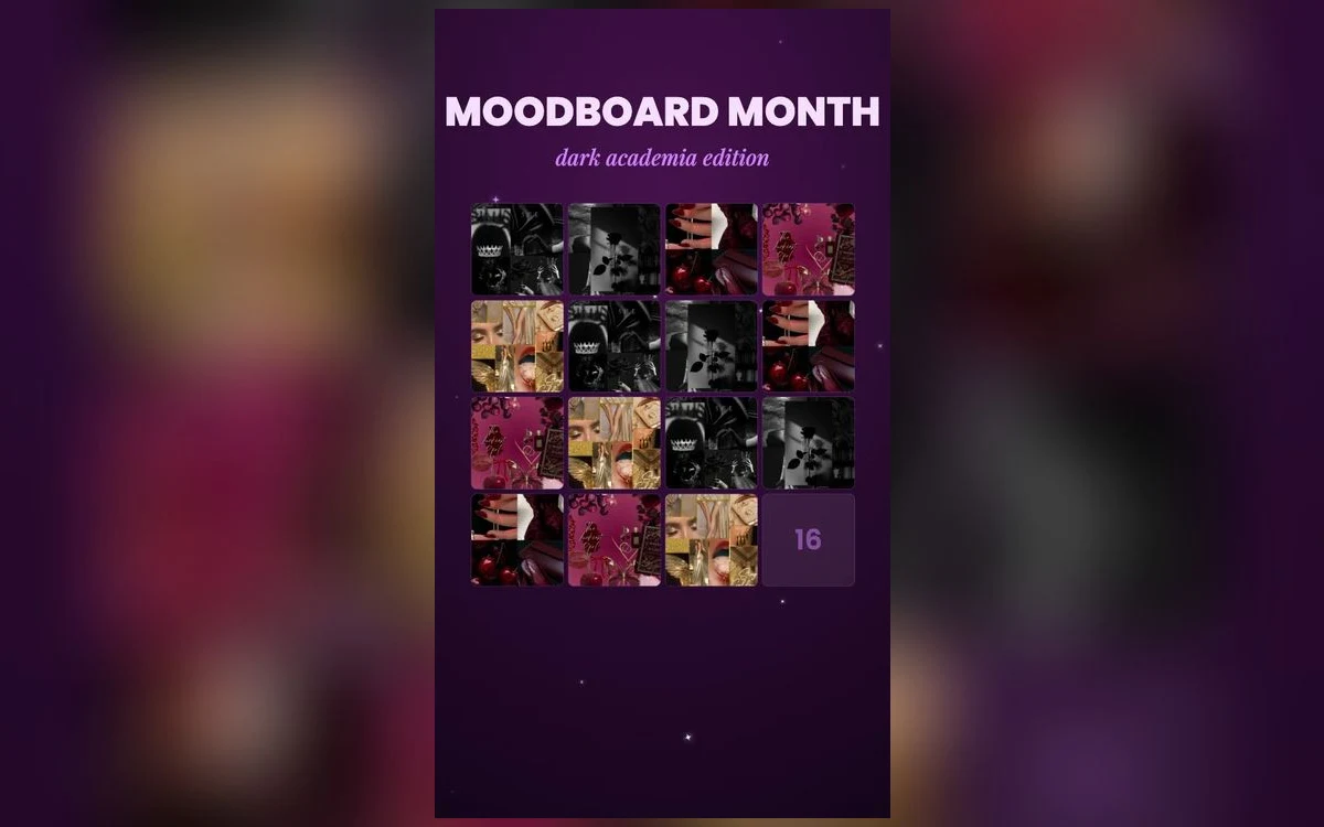
A collage wallpaper — a grid or scatter of small photographs behind your icons — is one of the few genuinely personal things you can put on a phone. It is also one of the hardest to make work, because a phone screen is small and a collage is many things at once.
Most of them look better in the preview than on the phone. Here is why, and how to build one that does not.
The problem in one sentence
A collage is composed to be looked at. A lock screen is composed to be looked past.
Every rule below follows from that. A collage rewards attention, and the thing you are putting it on is the surface you use to check the time, several times an hour, at arm's length. Those two goals genuinely conflict, and the good versions resolve the conflict rather than ignoring it.
Fewer photos than you think
The single biggest fix. A collage of twenty images is a texture — you cannot see any individual picture, and the wallpaper reads as busy noise from a metre away.
Four to six is the working range for a lock screen. Each one is large enough to recognise, and the arrangement still reads as a set rather than a single photo.
For a home screen you can go lower still. Two or three, arranged around where the icon grid sits, is often better than any grid.
Where the icons and the clock go
Plan the layout around the interface, not the other way round.
The clock takes the upper third. Any photograph you place there will be half covered, so either leave that area to a background colour, or accept that the top row is decoration rather than content.
On the home screen, the icon grid covers the middle. The visible strips are the top, the gap above the dock, and the narrow channels between icons. A collage designed without knowing that puts its best photographs exactly where the apps go.
The practical approach: build the collage with deliberate empty space at the top and in the middle, and put the photographs around the edges.
Make the pictures agree with each other
The difference between a collage that looks designed and one that looks like a camera roll is not the photographs, it is whether they share something. One palette, or one filter applied to all of them, or all black and white, or all from one place. Any single common thread turns a set of unrelated pictures into a composition. Without it, the eye has to process each image separately and the wallpaper never settles. This is also the easiest fix available: applying the same treatment to six photos takes a couple of minutes and does more than choosing better photos would.
Grid or scatter
Two layouts, and they are not interchangeable.
A grid — even rows and columns, equal sizes, consistent gaps — reads as deliberate and calm. It is the safer of the two, it tolerates photographs that do not quite match, and the regularity means the eye takes it in as one object rather than as several.
A scatter — overlapping images at slight angles, as though laid on a table — reads as warmer and more personal. It is also much harder to do well, because the overlaps hide parts of pictures and the angles fight the strict vertical of the clock and the icon grid.
If you are unsure, use a grid. The scatter version needs the photographs to already share a palette, and it needs generous empty space around the pile, or it reads as mess rather than as arrangement.
One thing that helps either layout: a consistent border. A thin cream or white edge around each photograph separates them from each other and from the background, which is why physical photo walls look tidier than digital ones.
Resolution matters more here than anywhere
Each photograph in a collage occupies a small part of the screen, which means each one is displayed small — and people assume that means quality matters less.
The opposite is true. The collage as a whole still has to be at least as large as your display, so each individual photo needs to be big enough to hold up at its share of that. Six small phone screenshots assembled into a grid produce a file that is soft everywhere.
Start from the original photographs rather than from copies saved out of a chat app, and build the collage at full screen size rather than scaling it up afterwards.
The alternative that usually works better
Before building one, it is worth knowing that iOS has a built-in version of this idea that avoids most of the problems: Photo Shuffle.
It shows one photograph at a time from an album you choose and changes it on a schedule. Each image gets the whole screen, so nothing is too small to see, and the variety comes from time rather than from cramming.
For most people who want a collage, this is closer to what they actually wanted. Build one if you specifically want several images visible at once; use Photo Shuffle if you wanted your photographs on the phone.
Quick answers
Will the depth effect work on a collage?
No. iOS needs one clear subject against a separable background, and a collage is a field of subjects. Expect the clock to sit flat on top.
Can I use a collage as a live wallpaper?
Not meaningfully. Motion in a collage is more distraction on an already busy image, and the lock screen only animates on wake and tilt anyway.
How do I stop it looking cluttered?
Fewer photos, more space between them, and one shared treatment. In that order.
Should the same collage go on both screens?
Usually not. A blurred version for the home screen keeps the palette and stops the photographs competing with the icons.
Where to get it
Preppy Wallpaper: Pink Cute has collage and photo-wall layouts already composed around where the clock and icons fall, previewed in a phone-shaped frame, which saves the layout problem entirely.
Try Photo Shuffle first. It is what most collage wallpapers are trying to be.