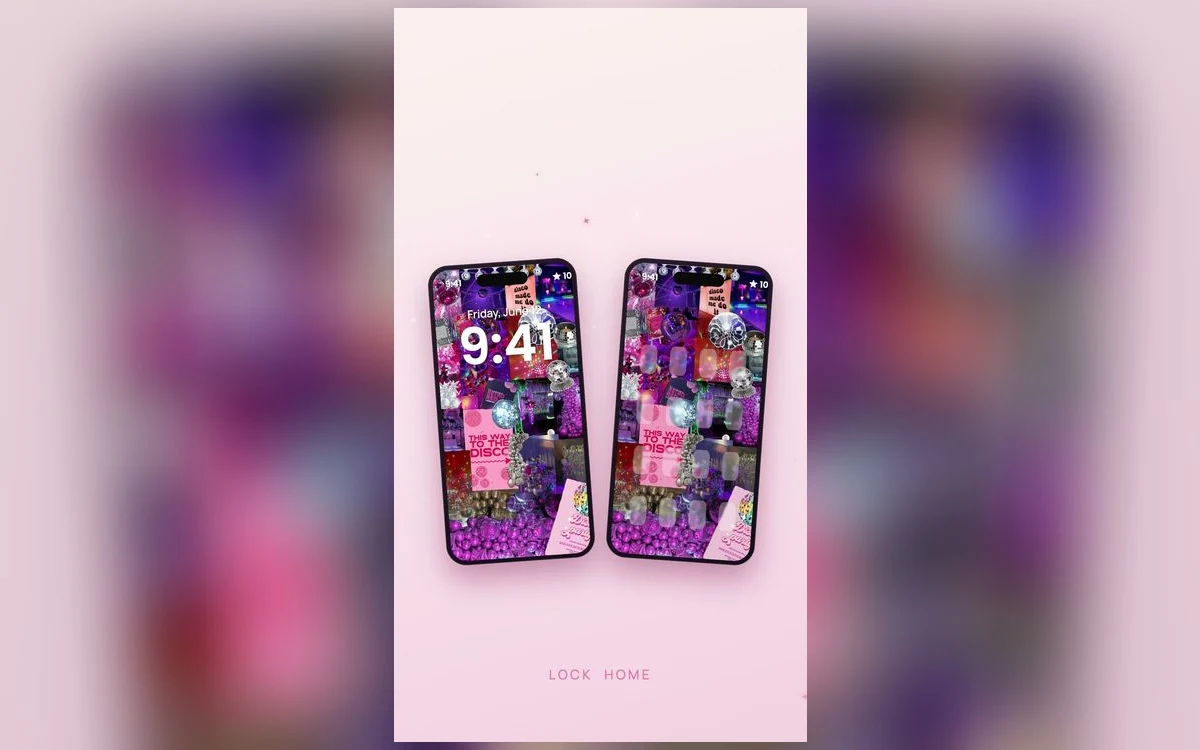
You have seen the home screens that look designed. Matching muted icons, one clock widget, a lot of calm empty space. Yours has thirty apps, a scattering of red badges and a wallpaper you stopped noticing months ago.
The gap is rarely taste, and almost never an expensive icon pack. It is order. Most people start with the fun part, custom icons, then make everything else fit around them, and end up fussy in a new way.
Do it in the other direction and it takes about twenty minutes. Here is the sequence that actually holds together.
Step one: take things away before you add anything
Nothing later will fix a screen with too much on it. Start by deciding which apps you genuinely open most days, usually a dozen or so, plus the four in the dock.
Press and hold an app you rarely use, choose Remove App, then Remove from Home Screen. It stays installed and stays in the App Library, findable by swiping past your last page or searching. Nothing is deleted.
Do the same with extra pages. If you have four, the first is the only one you really look at and the rest are storage.
Step two: the wallpaper sets every rule that follows
Pick the wallpaper next, before icons or widgets, because it decides what will be readable on top of it. A light cream background lets dark icons and dark widget text read clearly. A very dark background flips that, and pale widgets start to glow.
Decide how busy it can be, too. A strong pattern competes with app icons, and the icons lose. If you love a busy design, put it on the lock screen and use a plainer version, or the blur option offered while you set the pair, on the home screen.
This step deserves real time. Browsing a collection like Preppy Wallpaper: Pink Cute is faster than searching the web, because the images are grouped by palette and already sized for a phone, so you can compare a whole colour family at once.
Step three: pick two widget sizes and stop
Widgets are the fastest way to make a screen look considered, and the fastest way to wreck one. The trap is variety. Three different sizes in three different styles reads as clutter no matter how nice each one is.
Choose two, at most. A common pairing is one medium widget across the top of the page and one small one somewhere below it. Keep them functional: a calendar, the weather, a photo, battery levels. A widget you never look at is decoration taking up the space of four apps.
For more information without more visual noise, drag one widget onto another of the same size to make a stack and swipe through them. One shape, several things.
Step four: leave space on purpose
This is what separates a designed screen from a full one. Empty space is not wasted, it lets the wallpaper show and gives your eye somewhere to rest.
On iOS 18 and later you can place icons anywhere on the grid and leave rows or columns empty. On older versions the same effect took transparent spacer widgets or a lot of patience.
A layout that works almost every time: widgets on the top third, one or two rows of apps below them, and the bottom third left bare except the dock. It sounds like too little. It looks correct.
Step five: icons last, and only if you still want them
By this point the screen may already look the way you wanted, which is the argument for leaving icons alone. If you do want them changed, know what it costs first.
Custom icons are made in the Shortcuts app using Add to Home Screen, which creates a tile with your chosen image. These tiles do not show notification badges, and the original app stays in the App Library. How quickly a tile hands off to the real app has improved across iOS versions, but it has never been identical to tapping the app itself.
Try tinted icons before you spend an hour in Shortcuts
Recent iOS versions include dark and tinted icon appearances, reached by pressing and holding an empty part of the home screen and opening the customise options. Tinting recolours every Home Screen icon into a single shade you choose, so the grid matches your wallpaper in about a minute, with badges intact and nothing to maintain. Most of the coordinated look, none of the effort, and you can still do the manual version later.
Give it a week before you change anything
A home screen that looks beautiful in a screenshot can be annoying to use. You reach for an app and it is not where your thumb expects, or a custom icon is unreadable at a glance because you stripped out the only thing that distinguished it.
Live with it for a week before rebuilding. Move anything you keep missing toward the bottom of the screen where your thumb lands, and swap out any icon you squint at. That pass is what turns a nice-looking screen into one you keep.
Quick answers
How do I change app icons on my iPhone?
Use the Shortcuts app, create a shortcut that opens the app you want, then choose Add to Home Screen and pick your own image. Hide the original afterwards so you do not have two of everything. The custom tile will not show notification badges.
How many apps should be on my home screen?
Only the ones you open most days, which is usually fewer than you expect. Everything else lives in the App Library and can be found by swiping past your last page or pulling down to search, so there is little benefit to keeping it on show.
Can I have a different home screen for work and for evenings?
Yes. Focus modes let you choose which home screen pages appear while a Focus is on, so you can build a work page and a personal page and let the phone switch. The setting sits inside each Focus in Settings, and the wording varies by version.
Why does my home screen look empty when I add fewer apps?
Because the wallpaper is doing the work instead of the icons, which is the point. If it feels too bare, add one widget rather than another row of apps. Widgets fill space with something you actually use.
Where to get it
If you are starting at step two and need a background worth building around, Preppy Wallpaper: Pink Cute has matching lock and home screen designs grouped by palette, which saves you the job of finding two images that go together.
Build it in that order once and you will not need to redo it for months.