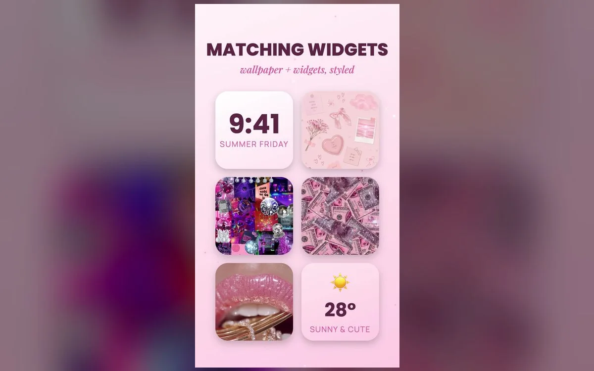
The difference between "nice wallpaper" and "aesthetic iPhone" is coordination. When your wallpaper, widgets and icons share one palette, the whole home screen looks intentional. The good news: it’s easier than it looks.
The three pieces of a preppy home screen
- Wallpaper — a preppy design with room at the top for the clock.
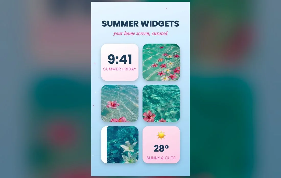
- Widgets — matching photo, clock or quote widgets in the same palette.
- App icons — custom icons (via Shortcuts) that tie everything together.
Build it step by step
- Set your wallpaper — pick a preppy lock-and-home pair in one palette.
- Add matching widgets — long-press the home screen → + → choose a widget, then pick one that fits your colors.
- Customize a few key icons — use the Shortcuts app → *Add to Home Screen* to give your most-used apps matching icons.
- Keep one clean page — put your favorites on the first page and hide the rest in the App Library.
Lock + home as a pair
Style your lock and home screens together — a busier, cuter lock screen and a calmer, coordinated home screen make the whole setup feel put-together.
The icon step, in full
Step three is where people get stuck, so here it is properly:
- Save your icon images to Photos first, one square image per app.
- Open Shortcuts → + → Add Action, search Open App, then tap App and choose the one you want.
- Name the shortcut exactly what you want written under the icon, then tap the share button → Add to Home Screen.
- Tap the small icon next to the name, choose Choose Photo, pick your image and tap Add.
- Long-press the original app and choose Remove from Home Screen so only the pretty version shows.
Two honest caveats: a shortcut icon opens the app through Shortcuts, so there’s a brief flash on the way in, and it can’t show a red notification badge. Do this for the four or five apps you open constantly and leave the rest alone.
The shortcut to the shortcut
On iOS 18 and later you may not need Shortcuts at all. Long-press an empty spot on the home screen, tap Edit → Customize, and choose Tinted. Drag the color sliders, or use the eyedropper to pull a shade straight out of your wallpaper, and every icon shifts to one matching tone. Badges keep working and nothing breaks when an app updates. It’s less bespoke than custom icons, but it’s the fastest route to a grid that reads as one palette. While you’re there, Large hides the icon labels, which instantly makes a page look calmer.
Pick widgets that earn their space
- Photos — point it at a specific album of your saved wallpapers so it never surprises you with a random screenshot.
- Clock or Calendar — one, not both. Choose the one you actually glance at.
- Batteries — the small circular version is genuinely useful sitting next to a decorative widget.
- A stack — drag one widget onto another to stack them, then turn off Smart Rotate if you want it to stay put.
Keep it cute and functional
- Don’t over-clutter — a few matching widgets beat a wall of them.
- Match, don’t clash — stick to one palette across wallpaper, widgets and icons.
- Refresh seasonally — swap the set when your vibe changes.
If something looks off
- The wallpaper is blurred behind the icons. That’s deliberate, to keep icons readable. Go to Settings → Wallpaper, tap Customize under your home screen and turn Blur off.
- Your icons look fuzzy. The source image is too small. Use square images made for a phone screen, not thumbnails saved out of a chat.
- The grid feels crowded. On iOS 18 you can drag icons into any slot and leave gaps, so keep the bottom rows clear and let the wallpaper show through.
- You can’t find an app. Swipe left past your last page to the App Library, or pull down on the home screen and search. Nothing was deleted.
Your questions, answered
Do custom icons slow my iPhone down?
No, but they add a half-second redirect through Shortcuts and they can’t display notification badges. That’s the reason to customize only the handful of apps you tap all day, and to leave Messages or Mail as they are so you still see what’s waiting.
How many widgets should one page have?
One or two on your main page is plenty. Widgets are large, and the quickest way to lose the aesthetic is to fill every gap — the breathing room is what lets the palette read as a palette.
Will an app update wipe my custom icon?
No. The shortcut points at the app, so updates leave it untouched. Deleting and reinstalling the app is the thing that breaks the link, and you’d just rebuild that one shortcut.
Can I hide a whole page instead of moving apps one by one?
Yes. Long-press the home screen, tap the row of dots above the dock, and uncheck any page you want out of sight. Everything on it stays available in the App Library and in search.
Where to get the pieces
Matching wallpapers, widget backgrounds and icon-friendly designs all live inside Preppy Wallpaper: Pink Cute — a free app with coordinated preppy sets, refreshed regularly. Grab a matching set and build your cutest home screen yet.