Apple lets you change nearly everything about the lock screen — the clock font, the widgets, the photo, the depth effect. What it does not let you do is put your own name on it.
That gap is why people end up with awkward workarounds: a text widget that looks like a system label, or a photo edited in an app that was never meant for typography.
There are three practical routes. They are not equally good.
Route one: a text widget
The fastest option. Add a widget that displays custom text, type your name, done.
The problem is that it looks exactly like what it is — a widget. It sits in a fixed slot, it uses the widget's own type, and it competes with the clock rather than sitting under it. On a carefully chosen wallpaper it reads as clutter.
It also cannot use the depth effect, which is the single feature that makes a modern iPhone lock screen look layered rather than flat.
Route two: edit a photo yourself
Open a design app, add a text layer, export, set as wallpaper. Full control, and if you know what you are doing the result can be excellent.
The catches are practical. Getting the name to sit correctly means knowing where the clock and the widget row will land, which you cannot see while designing. Most first attempts end up with the name half-hidden behind the time.
Then there is the type itself. A name set in a default sans-serif at whatever size looked right on a laptop rarely survives being scaled onto a phone screen.
Design for the clock, not the canvas
The top third of an iPhone lock screen is spoken for — the clock, the date, and the widget row all live there. Whatever route you take, the name belongs in the middle or lower third, or it will be covered the moment you set it.
Route three: a name wallpaper app
The purpose-built option. You type your name, choose a style, and the app composes the wallpaper with the layout already accounting for where iOS puts its own elements.
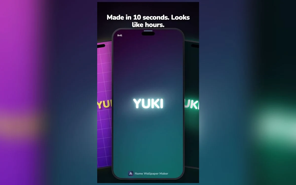
This is what Name Wallpaper Maker does. The styles cover the ranges people actually want — neon glow, chrome and gold, marble, vaporwave gradients, minimal thin type, retro 3D — and each one is built as a complete design rather than a font dropped on a background.
The practical advantage is time. A wallpaper you would spend twenty minutes composing takes about ten seconds, and you can try six styles before committing to one.
Which to choose
If you want a name on screen and do not care how it looks, the widget is fine and free.
If you are a designer with a specific vision, do it yourself — nothing beats full control.
For everyone else, a purpose-built app is the honest recommendation. Not because designing is hard, but because the layout constraints of a lock screen are invisible until you have already got them wrong twice.
Making it look intentional
Whatever route you pick, three things separate a good result from a homemade one.
Contrast. A light name on a busy photo disappears. Either darken the background behind the text or pick a style built with its own contrast.
Placement. Centre-lower is the safest zone. It clears the clock, sits above the flashlight and camera buttons, and reads as deliberate.
Restraint. One name, one style. A name plus a quote plus a date plus a monogram is four ideas fighting for a space the size of a postcard.
Getting the depth effect to work
The layered look — where the clock slides behind part of the image — is what makes a modern lock screen feel three-dimensional rather than pasted on.
iOS decides whether to offer it by looking for a clear subject with defined edges against a distinct background. A photograph of a face triggers it easily. A flat exported graphic often does not.
For a name wallpaper, the practical rules are: keep the name well separated from the background in both colour and value, avoid busy textures directly behind the letters, and place the name where it can overlap the clock's lower edge rather than sitting far below it.
When it works, the top of your name tucks behind the time and the effect is genuinely striking. When it does not, iOS simply shows the image flat — nothing breaks, you just lose the layering.
Home screen versus lock screen
The same image rarely works equally well in both places, and iOS lets you set them separately for a reason.
On the lock screen the name is the subject. Nothing competes with it except the clock, so the design can be bold.
On the home screen your app icons sit on top. A busy or high-contrast wallpaper makes icon labels hard to read and the whole grid feels noisy. The version that works here is quieter — the same style at lower intensity, or the same palette without the name at all.
Many people settle on a bold name on the lock screen and a plain gradient from the same palette on the home screen. The two read as a set without fighting each other.
Keeping it readable through the day
A lock screen is looked at in bright sun, in a dark room, and at a glance from a metre away. A design that only works in one of those conditions is a design you will replace within a week.
The quick test: set it, then look at the phone outdoors, then in the dark with the always-on display active. If the name survives all three, it will last.
High contrast is what carries a design across those conditions. Subtle tonal differences that look sophisticated indoors vanish completely in sunlight.
Quick answers
Can I add my name without an app?
Yes — a text widget or a photo you edit yourself. Both work; neither gives you the layered look of a wallpaper designed around the lock screen layout.
Will the depth effect work with a name?
Depth effect works when iOS detects a clear foreground subject. A wallpaper built with a distinct name layer over a background is far more likely to trigger it than a flat exported image.
Does this work on the home screen too?
Yes. You can set the same image for both, though many people prefer a quieter version on the home screen so app icons stay readable.
Will it slow my phone down?
No. A wallpaper is a static image. Even the animated styles are lightweight compared with anything that runs continuously.
Where to get it
Name Wallpaper Maker: Neon is free to start, needs no account, and takes about ten seconds from typing your name to a finished lock screen.
Pick one style, set it, and see how it looks after a day. That is a better test than comparing thumbnails.