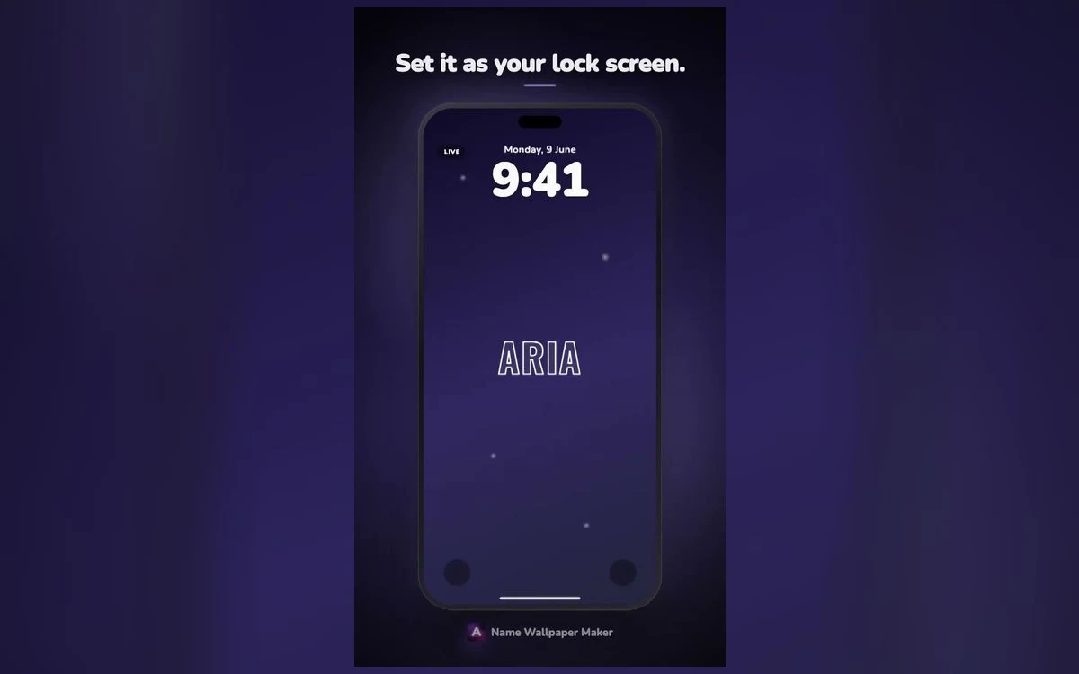
You found a wallpaper you liked, set it on both screens, and by the end of the day the home screen was quietly annoying you. Half the name sits behind the dock. The icons land on the interesting part. Everything looks slightly cluttered without being obviously wrong.
That is not bad luck and it is not a bad wallpaper. The two screens are asked to do completely different jobs, and an image that is good at one is usually mediocre at the other.
Once you see what each screen is for, setting them separately takes a minute.
One screen is a poster, the other is a background
The lock screen is looked at on its own. You raise the phone, glance for a second or two, and the only things sitting on the image are the clock, the date and any notifications. Nothing competes with it, so it can carry a big name, strong colour and fine detail.
The home screen is never looked at on its own. It is a surface behind a grid of small, bright, saturated objects you are trying to find things in. Whatever sits behind those icons competes with them, and the icons have to win.
A poster wants to be seen. A background wants to go almost unnoticed and still feel like yours.
What iOS puts on top of each one
On the lock screen, the date sits above the clock, the clock takes the upper part of the screen, widgets can sit under it, and notifications stack from the bottom. On many iPhones a photo can use the depth effect, where iOS separates a subject and lets it overlap the clock, though that only works with some images and switches off when widgets are in the way.
On the home screen, icons fill a four-column grid, each with a small light label underneath, and the dock sits at the bottom on its own frosted panel, with page dots and a search pill above it. Since iOS 18 you can leave deliberate gaps in the grid instead of icons packing in from the top left, which turns out to be useful here. Exact layouts shift between iOS versions and screen sizes, so treat all of that as regions rather than fixed positions.
Why the same image rarely works twice
The first reason is position. A name centred beautifully on the lock screen ends up behind the third row of icons, because the free space sits somewhere else. Nothing about the image changed; everything on top of it did.
The second is contrast. Icon labels are light with a soft shadow rather than switching to dark over a pale wallpaper, so a bright background makes app names harder to read while a dark one keeps them crisp. The icons are already loud, and a busy image behind them turns the grid into noise.
The third is blur. iOS offers a blur option for the home screen version of a wallpaper, which exists precisely because backgrounds want to be quiet. Blur a name and it is unreadable, so you lose either the name or the calm.
Give the home screen its own image before you tap Done
The moment to split them is in the wallpaper editor. After you add a new wallpaper, iOS shows both screens and offers something like Set as Wallpaper Pair or Customize Home Screen. Customize is the one place you can hand the home screen a different photo, a plain colour, a gradient, or the same photo blurred. Skip it and iOS pairs them for you.
What to put behind app icons
The reliable choice is a dark, quiet field in the same colour family as your lock screen. Dark works for two reasons: bright icons stand out against it, and light labels stay readable. A soft gradient in one hue does the job and still feels designed.
The second option is the same wallpaper with blur on, which keeps the colours and throws away the detail. It is the fastest way to make two screens feel related.
The third is a version made for the home screen: same style and colour, name small, placed where no icon sits. This is where grid gaps help, since you can leave the top rows empty and let the name live there instead of hiding under apps.
If you use tinted icons, iOS can sample a tint from the wallpaper, which is another argument for a background built from one colour.
Where the name should actually sit
On the lock screen, the safe band runs from the bottom of the clock to the top of the notification stack, roughly the middle third. Anything lower gets covered the moment three messages arrive, which is easy to forget while judging an empty screen.
On the home screen, position depends on what you will move. With icons on one page, leave the top rows empty and put the name there. With a full grid, do not fight it: use a plain or blurred background and let the lock screen carry the name.
Making a matched pair in a couple of minutes
Export two versions in the same colour and style rather than using one image twice. Name Wallpaper Maker: Neon takes about ten seconds a version, so make a bold one with the name large and centred, then a quiet one with the name small and low.
Save both to Photos, set the bold one as the lock screen, then customize the home screen and pick the quiet one. The pair reads as a set because the colour matches, not the image.
Quick answers
Can I use one image for both if I really like it?
Yes, and blur on the home screen version is what makes it work: you keep the colours and lose the detail that fights the icons. If the name is why you like the image, accept that the blurred copy will not show it.
Why does my home screen wallpaper look washed out?
Most likely blur or dimming is on for that screen, which iOS applies so icons stand out. Go to Settings, then Wallpaper, tap Customize under the home screen preview and turn blur off.
Do the two screens have to match at all?
No, and matching colour is usually enough. Two images in the same palette feel like a set even when they show different things, while identical ones just feel repetitive.
Where to get it
Name Wallpaper Maker: Neon types a name into a finished wallpaper in about ten seconds, with styles including neon, gold plate, chrome, retro 3D, aurora, marble, edge lighting and monogram crest, so making both the loud lock screen version and the quiet home screen one is quick: on the App Store
Set the pair once, and the phone stops looking busy every time you unlock it.