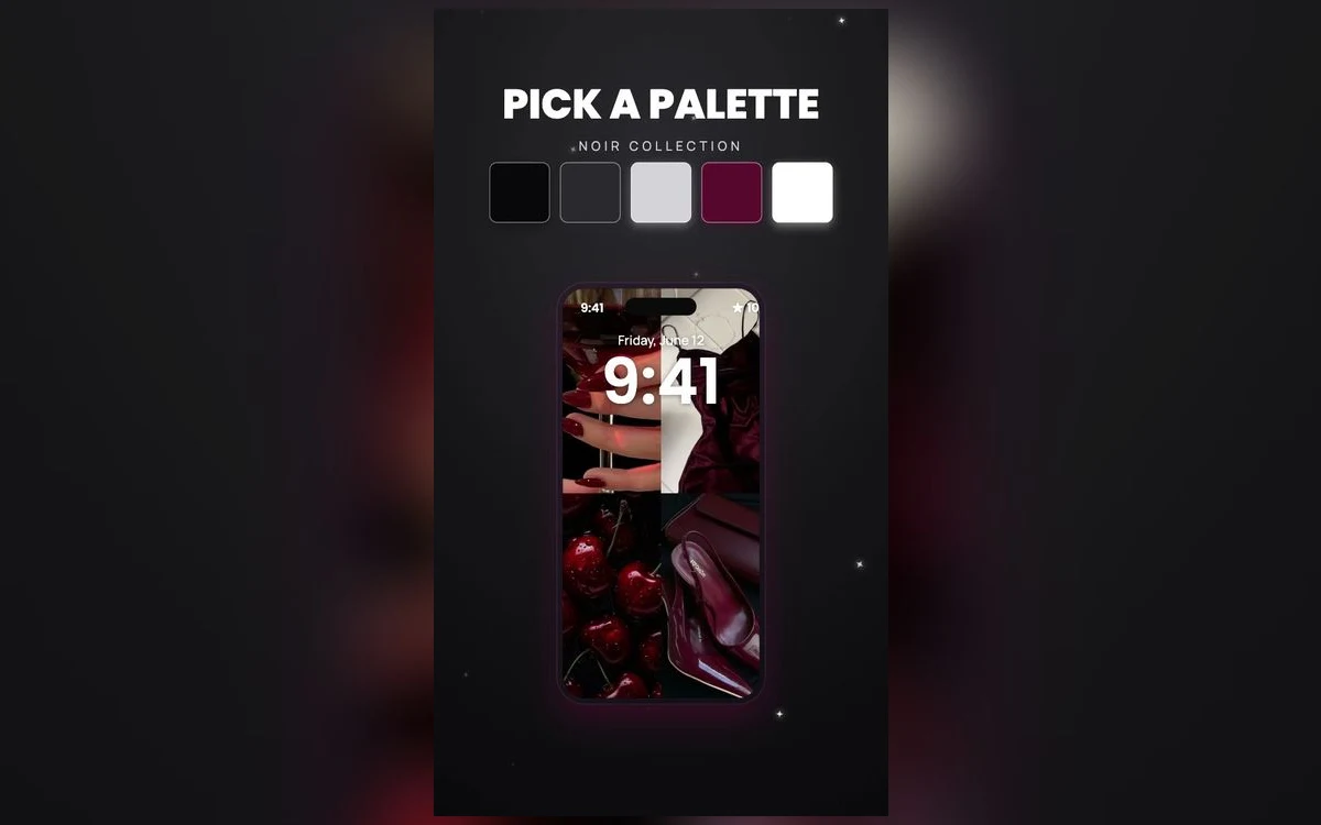
There is a specific look you are after: the phone that stays quiet. Dark, filmic, the kind of screen that does not announce itself when you put it face up on a table.
Most people go at it with a plain black image, decide it feels flat, then try a moody photo instead and end up with a dark smear that icons float on top of.
Noir is not the absence of light. It is a small amount of light, placed carefully. Once that clicks, most of what goes wrong with dark wallpapers is fixable.
Black is a color choice, noir is a lighting choice
A pure black wallpaper is a decision to show nothing. Icons are perfectly legible on it, and it stops being interesting in about a week, because there is nothing to notice.
Noir keeps most of the frame in shadow and gives you one bright thing: a window, a lamp, a face turned toward a light, a wet street under a sign. Your eye has somewhere to land and the rest stays out of the way. The test when you are choosing images is whether you can name the light source. If you cannot say where the light comes from, the picture will read as murk on a phone.
Why grain helps more on a phone than anywhere else
Dark images are mostly gradient, long slow slides from black through grey. Gradients are where image compression struggles, and the result is banding: visible steps or blotches instead of a smooth fade. It shows up worst on pictures that have been screenshotted, sent through a chat app and saved again.
Grain covers that. Fine texture breaks up the steps, so your eye reads film stock rather than a compression fault. On the OLED panels in most recent iPhones the deepest blacks are genuinely black, which makes grain read as deliberate.
The icons that vanish on a dark background
Everyone checks whether the white icons still work. They do. The ones worth checking are the near-black tiles, which lose their edges entirely once the wallpaper behind them is also near black. You stop reading them and start finding them by position.
The principle is the one that makes pale icons vanish on cream, running the other way: contrast comes from a difference in lightness. Keep the slightly lighter part of the wallpaper behind the rows you use most, or move your darkest apps into a folder.
Recent iOS versions added a dark icon appearance alongside tinting, which pushes many icons darker still. It looks good and makes this problem worse, so check your real home screen after. Which options appear, and how many apps support a true dark icon, varies by version and by app.
Choose it at the brightness you actually use at night
You pick wallpapers indoors near full brightness, then look at the lock screen mostly in bed at a fraction of that, where shadow detail collapses into flat black and a subtle image becomes nothing. Set the candidate, turn the brightness down to where you keep it at night, and lock the phone. If you can still tell what the picture is, it will work everywhere else.
Where the light should sit in the frame
Two things on the lock screen never move: the clock near the top and the notification area along the bottom. On the home screen it is the grid and the dock. A wallpaper does not get that space, whatever the preview suggests.
That leaves the upper middle as the comfortable home for the bright part of a noir image, below the clock and above the widgets, where it gives depth without being covered. A highlight in the bottom third loses an argument with the notification stack every time a message arrives. If it lands exactly where the numbers are, recrop the image or change the clock color.
Lock screen settings that suit a dark image
White or pale grey numbers are the obvious choice on noir. Mid-grey is the one to avoid, since it sits too close to the wallpaper to read at a glance. Tap the time in the lock screen editor to change font and color.
The depth effect is harder to get on dark photos, because it needs a subject the system can separate cleanly from its background, and noir images are built on soft edges. On iPhones with an always-on display, the lock screen dims further when the phone is idle, so a very dark wallpaper can go close to invisible. iOS also dims wallpapers in certain conditions and offers an appearance toggle for some wallpaper types, though where that lives depends on your version.
One accent color, and no more
Strip a picture down to greys and any remaining color becomes the subject. That is why monochrome with one accent reads as deliberate, while two accents read as an ordinary photo that happens to be dark.
Cherry red survives contact with the most icon sets, deep enough not to compete with app artwork and warm enough to stop the screen feeling clinical. Cherry noir is a standing palette in Preppy Wallpaper: Pink Cute for that reason. Amber gives you the streetlight version. Cold blue looks sharp but makes white icons feel harsh, so use it in small amounts.
Quick answers
Do black wallpapers save battery on iPhone?
On the OLED screens most recent iPhones use, a black pixel is switched off, so a mostly black wallpaper does use less power than a bright one. The effect is real but modest next to brightness and screen time. On LCD models such as the iPhone 11 the backlight stays on regardless, and it makes no difference.
Why does my dark wallpaper look blotchy or striped?
That is banding, and it comes from compression rather than your screen. Screenshots and images pulled out of chat apps are the usual culprits. Use the full-size original, and prefer images with some grain, since texture hides the steps.
Does the depth effect work with dark photos?
Sometimes. It needs a subject with a defined edge, so a high-contrast silhouette can work where a soft, evenly dark image will not. Adding lock screen widgets can also turn it off.
What clock color should I use on a black wallpaper?
White or a pale neutral, with a lighter font weight if you want it understated. Avoid mid-grey, and avoid saturated colors, which glow against a dark field and pull attention off the picture.
Where to get it
Preppy Wallpaper: Pink Cute is better known for its pink sets, but recent seasons include full noir and cherry noir palettes, sized for iPhone screens and free to browse.
Start with one image that has a light source you can point at, and build the setup around it.