Coquette is preppy’s softer, dreamier cousin — think ribbons, pearls, lace and a gentle pink palette. It’s romantic, delicate and endlessly cute. Here’s how to build the look on your lock screen.
What makes it "coquette"
- Bows & ribbons — the signature coquette motif.
- Soft, muted pinks — gentle and dreamy, not loud.
- Lace & pearls — delicate, vintage-inspired details.
- A romantic mood — soft-focus, hazy, girly.
The tell is restraint. A Y2K wallpaper turns the saturation up and puts a chrome butterfly in the middle; coquette pulls the saturation down and lets one small detail sit in a lot of empty space. If a design feels quiet from arm’s length and cute up close, it’s coquette.
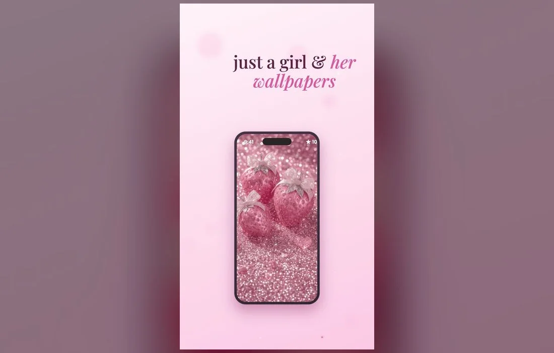
Five soft-girl looks and who they suit
- Single satin bow — one ribbon on a plain blush field. The most recognizable coquette image, and the easiest to read behind a clock because the rest of the frame stays empty.
- Lace edge — a delicate border framing a pale center. Lovely on the lock screen, and the middle stays clean for widgets.
- Pearl scatter — small pearls or beads over cream. Softer than glitter, and it doesn’t compete with your app icons.
- Pressed flowers — faded roses or dried petals with a slight grain. The most vintage-leaning option, and the best pick if pure pink feels like too much.
- Cherry and strawberry prints — tiny fruit motifs on white or milk pink. Cute, a little playful, and the one that ages best when you’re bored of bows.
Build the soft-girl look
- Pick a lock screen with soft pinks and a delicate motif.
- Match your home screen in the same muted palette.
- Keep it calm — coquette is about softness, so avoid busy designs.
- Add a gentle clock font or widget to complete the vibe.
Softer is better
Coquette leans muted and gentle. Choose soft, hazy wallpapers over bright, high-contrast ones for that dreamy soft-girl feel.
Set it in seconds
- Open Preppy Wallpaper: Pink Cute and browse the soft/coquette styles.
- Preview a wallpaper, then save it.
- Settings → Wallpaper → Add New Wallpaper, pick it, set it for lock and home.
- While the editor is open, tap the clock and switch to a thinner font in white or a warm cream. The default bold face fights the softness.
- Tap Customize Home Screen and drop the blur on, or choose a plainer version of the same design so your icons stay findable.
When soft turns into washed out
The line between dreamy and muddy is thin, and it usually shows up after you set the wallpaper rather than in the preview.
- The clock disappears into the background. Pale pink behind a white clock is the classic failure. Switch the clock to a deeper rose or a soft brown, or drag the image so a slightly darker area sits under the time.
- Everything looks gray in the sun. Very low-contrast wallpapers wash out outdoors. Keep one motif with real edges — a bow, a border, a flower — so the design still reads.
- The image looks grainy. You likely saved a thumbnail rather than the full file, or cropped in too far. Re-save it and let iOS place it without pinching.
- Depth Effect eats your widgets. Tap the three-dot button in the wallpaper editor and turn it off.
Complete the coquette look
A wallpaper is the foundation, but a few small touches finish the aesthetic. Choose a thin, elegant clock font over a bold one, keep your widgets to a tidy pair in matching soft tones, and let a delicate motif — a bow, a ribbon, a single rose — sit near the center so it frames the clock. The whole idea is softness and restraint: gentle colors, a little negative space, and nothing that competes with the dreamy, romantic mood.
Coquette questions, answered
What is the coquette aesthetic?
A soft, romantic look built on bows, lace, pearls and muted pinks — preppy’s dreamier cousin. It borrows from ballet, vintage lingerie and old love letters, which is why ribbon and lace turn up everywhere in it.
How do I make my iPhone look coquette?
Pair a soft-pink wallpaper with a gentle clock font and a couple of matching widgets. Keep your first home page short so the wallpaper has room to show, and pick app widgets in cream or blush rather than dark ones.
Is coquette the same as soft girl?
They overlap heavily. Soft girl is the broader mood — pastels, hazy light, gentle everything — while coquette is the more specific bow-and-lace version of it. Most people run both without worrying about the label.
What if pink isn’t my color?
Coquette works in cream, butter yellow, sage and pale blue as long as you keep the softness and the delicate motifs. Swap the palette, keep the ribbon, and the aesthetic still lands.
Where to get them
All the coquette and soft-girl looks above live inside Preppy Wallpaper: Pink Cute — a free app full of soft, cute aesthetics, refreshed regularly. Browse, preview and set your dreamiest wallpaper in under a minute.