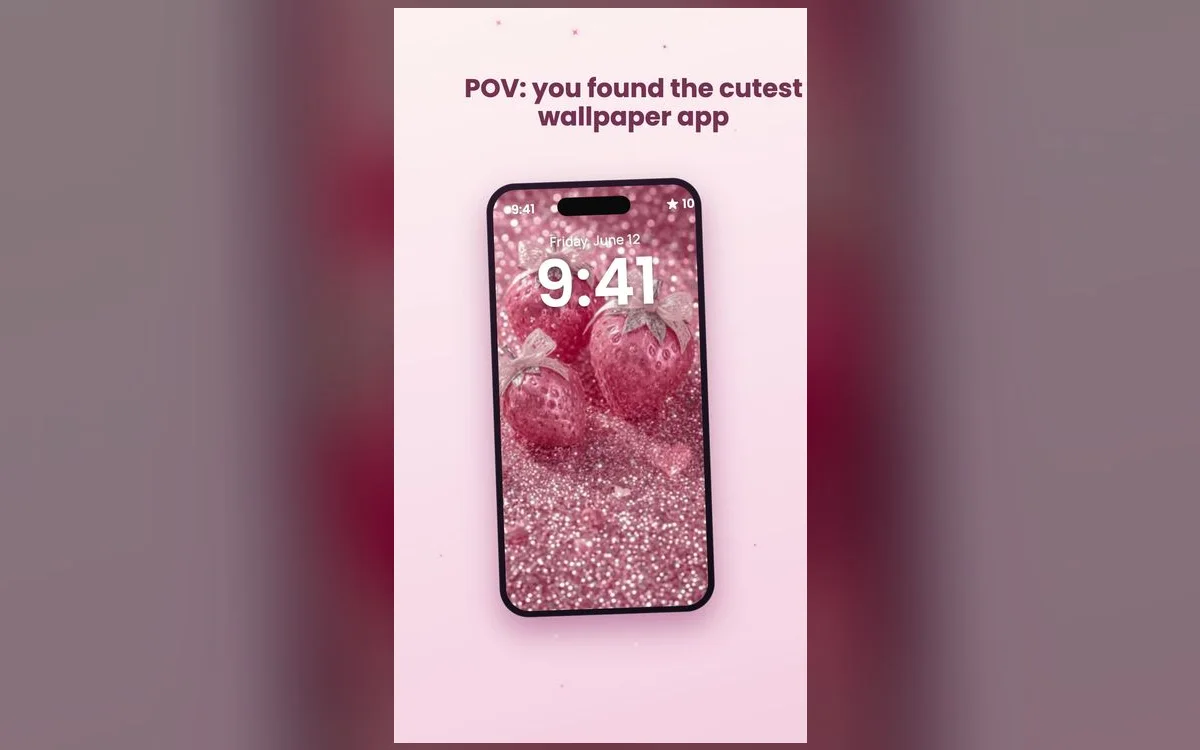
The preppy aesthetic is all about soft pinks, bows, hearts, checkerboard and hand-drawn doodles — a look that feels bright, girly and fun. It’s become one of the most-set wallpaper styles on iPhone, and the good news is you don’t need any design skills to get it. You just need the right wallpapers and a couple of minutes.
What makes a wallpaper "preppy"
Not every pink wallpaper is preppy. The look has a few signatures:
- Soft pastel pinks with pops of green, blue or lilac.
- Cute motifs — bows, hearts, smileys, checkerboard and stars.
- Hand-drawn, sticker-style doodles rather than photos.
- A clean layout that leaves room for your clock and icons.
The giveaway is the drawing style. Preppy leans marker-pen and sticker-book: flat colors, visible outlines, a little wonky on purpose. Anything glossy or photographic drifts into a different aesthetic, even when the color is right.
The sub-styles inside preppy
Preppy is a family, not one look. Five worth knowing:
- Bows and ribbons — the softest end, close to coquette. Pale pink and cream, and the easiest to read a clock against.
- Checkerboard — pink and white or pink and green squares. Bold and graphic, but scale matters: big squares behind app icons get noisy fast.
- Smileys and happy faces — the most cheerful option, and forgiving because the faces repeat evenly.
- Fruit prints — strawberries, cherries and lemons. Warmer than the rest, and it reads as intentional when the fruit is the only motif.
- Monograms and initials — one letter, big and centered. Great on a Lock Screen, terrible under a full grid of apps, so pair it with a plain home screen.
Build your preppy home & lock screen
The trick to a put-together look is matching, not just one wallpaper:
- Pick a lock screen wallpaper with space at the top for the clock.
- Choose a home screen version in the same palette so icons still read clearly.
- Add a couple of matching widgets for the full aesthetic.
- Rotate to a new drop when you want a fresh vibe — without changing your whole theme.
Soft-life tip
Keep your home screen calm and your lock screen bold. A busier, cuter wallpaper on the lock screen makes the biggest first impression, while a simpler home screen keeps your apps easy to find.
How to set a wallpaper on iPhone
- Open Preppy Wallpaper: Pink Cute and browse by style.
- Tap a wallpaper to preview it full-screen, then save it.
- Go to Settings → Wallpaper → Add New Wallpaper and pick the saved image.
- Set it for your Lock Screen, your Home Screen, or both.
- Tap the time while the preview is open to change the clock font, weight and color — the step most people skip, and it does more for the finished look than swapping wallpapers.
- Tap Customize → Home Screen and choose Photo for a sharp background or Blur for a softer one behind your icons.
Finish the look with widgets and icons
The wallpaper is two thirds of it. The rest sits on top:
- Tint your app icons. Press and hold an empty part of the home screen, tap Edit → Customize, choose Tinted, and drag the color slider toward pink. It unifies mismatched icons instantly.
- Pick widgets in the same palette. A Photos widget pointed at your own pink-heavy album blends better than any stock one.
- Leave the top row empty so the wallpaper actually shows. It sounds wasteful and it looks deliberate.
- Add a Lock Screen widget or two. Battery and Weather are the ones you’ll glance at, and both take the clock color you chose.
The mistakes that make it look messy
- Too many motifs at once. Bows plus checkerboard plus fruit reads as clutter. One motif, one palette.
- A stretched image. If a design looks soft or pixelated it was saved smaller than your screen. Pick another one.
- Tinting everything hot pink. Heavy tint kills the color differences you use to find apps. Keep it light.
Common preppy questions
Is preppy the same as coquette?
They overlap but aren’t identical. Coquette is softer and more romantic — bows, lace, muted blush. Preppy is brighter and more graphic, with checkerboard, smileys and stronger pinks. Plenty of designs sit in both.
Do I need another app to change my app icons?
Not for color — tinting is built into iOS through Edit → Customize on the home screen. Fully custom icon images still need Shortcuts, which adds a step every time you open an app, so most people give up on it.
How do I keep my old wallpaper when I try a new one?
Build a new one rather than editing the current one. Press and hold the Lock Screen, tap +, set up the new design, then swipe between them.
What if my wallpaper makes my icons hard to see?
Switch the home screen background to Blur, or move your busiest apps to a second page. A design that works on the Lock Screen often needs calming down behind a full grid.
Where to get them
All of the wallpapers above live inside Preppy Wallpaper: Pink Cute — a free app packed with preppy pink aesthetics, updated regularly with new drops. Browse, preview and set your favorite in under a minute, and give your iPhone the cutest glow-up.