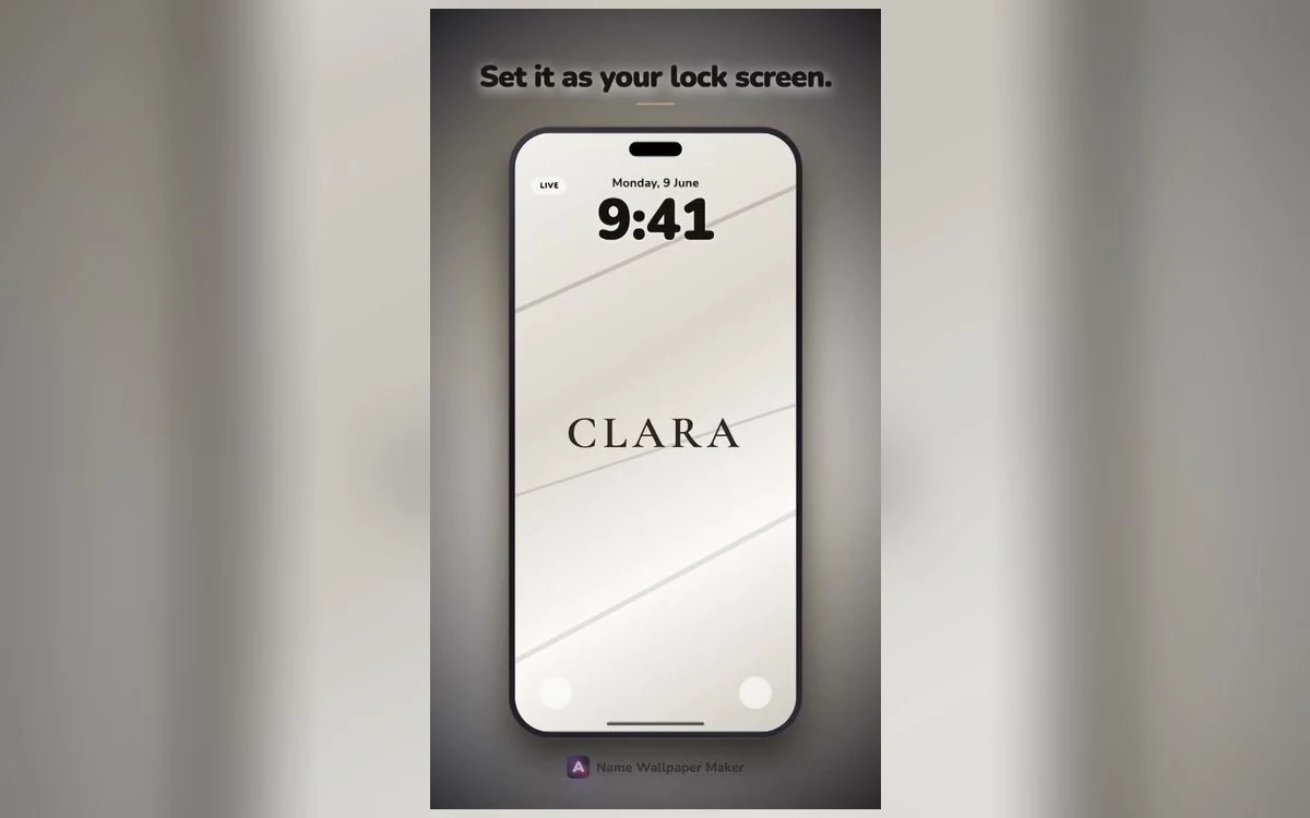
Minimal is deceptively difficult. With a loud style, the effect carries the design even if the details are slightly off. With minimal, the details are all there is.
The difference between a minimal wallpaper that looks intentional and one that looks like nobody finished it comes down to three decisions.
One: the weight of the type
Hairline type is the signature of the style, and it is also the most common mistake.
A very thin weight looks elegant at large sizes on a bright screen. Dim the display, view it outdoors, or shrink it to fit a long name, and it disappears. What read as refined now reads as faint.
The reliable range is light to regular rather than hairline — thin enough to feel restrained, substantial enough to survive real conditions. Save true hairline for short names on high-contrast backgrounds.
Two: the spacing
Minimal designs live or die on letter-spacing, and this is where most homemade attempts fall down.
Set at default spacing, a name in a light weight looks cramped — the letters cluster and the whole thing reads as a word rather than a mark. Opened up, the same name reads as deliberate.
The amount matters. Slightly loose looks considered. Very loose looks like a fashion logo, which is a specific effect rather than a neutral one. Somewhere in between is where most names sit best.
Space is the design
In a minimal wallpaper, the empty area is not leftover — it is the composition. If you find yourself wanting to add something to fill it, the design is working and the instinct is wrong. Adding a date, a symbol or a second line is how a minimal design stops being minimal.
Three: where it sits
Centred both horizontally and vertically is the obvious choice and rarely the best one.
On a lock screen, true centre puts the name uncomfortably close to the clock and leaves a large dead area below. Sitting the name at roughly the lower third clears the clock, balances against the flashlight and camera buttons, and gives the composition a clear structure.
Off-centre horizontally is a stronger move but a riskier one. It looks excellent when deliberate and like a mistake when it is off by a small amount.
Colour in a minimal design
Monochrome is the default, and there are only really three routes.
Black on white is the cleanest and the harshest at night. It works if you use the phone mostly in daylight.
White on black is easier on the eyes, better on OLED, and the most common choice. It also pairs with almost any home screen.
One muted colour — a soft sage, a dusty rose, a warm grey — gives the design personality without breaking the restraint. This is the version that ages best.
What does not work is a bright accent. A single saturated colour in an otherwise minimal design pulls all the attention to itself and the restraint elsewhere stops reading as a choice.
Minimal on the home screen
This is where minimal genuinely outperforms every other style.
App icons are colourful, dense and demanding. Any wallpaper with its own visual interest fights them. A quiet field with a small name in the corner, or the same palette with no name at all, lets the grid breathe.
Many people who use a bold lock screen still choose minimal for the home screen, and the two together work better than either style used twice.
Minimal that is not monochrome
Monochrome is the default reading of minimal, but restraint is about quantity of elements rather than absence of colour.
A single muted hue across the whole background, with the name in a slightly lighter or darker value of the same colour, is still minimal — there is one idea and one colour family. It reads warmer than black-and-white and dates less quickly than a saturated palette.
Tonal designs like this are the most underused option. A deep olive ground with the name in a paler olive, or a warm grey with an off-white name, feels considered in a way pure monochrome sometimes does not.
The test is whether you can describe the design in one sentence. If you can, it is still minimal, whatever the colour.
Adding one thing without breaking it
Sometimes a name alone genuinely does feel too sparse, and the instinct to add something is right rather than wrong.
The additions that survive: a thin rule under the name, a single dot or small mark, or a second line at much smaller size — an initial, a year, a single word. Each of these is subordinate to the name rather than competing with it.
The additions that break it: a quote, a date in the same size as the name, a decorative frame, or an icon. All of these introduce a second focal point, and minimal designs only have room for one.
The rule of thumb is hierarchy. If a viewer's eye has to choose where to look first, the design is no longer minimal.
Why minimal outlasts other styles
Every visual trend has a shape that dates it. Vaporwave is unmistakably a specific decade's revival. Retro 3D belongs to a particular moment in interface design. Even neon, which has been around for a century, carries the flavour of whenever it was last fashionable.
Minimal has less to date. A name set in a light weight with generous spacing on a plain ground looked current twenty years ago and will look current in another twenty.
That is the practical argument for it, quite apart from taste: it is the style least likely to make you want to change your wallpaper.
Quick answers
Is minimal boring?
It can be, if the spacing and placement are default. A minimal design with considered spacing reads as confident; one without reads as unfinished. The difference is entirely in the details.
What font weight should I use?
Light or regular for most names. True hairline only for short names on strong contrast.
Should the name be uppercase?
Uppercase with generous spacing reads as a wordmark and suits minimal well. Lowercase reads softer and more personal. Both work; sentence case is the weakest of the three.
Will minimal look good with the depth effect?
Often not — depth effect needs a clear subject with defined edges, and thin type on a plain ground rarely qualifies. That is a fair trade for how well minimal works everywhere else.
Where to get it
Name Wallpaper Maker: Neon includes minimal thin and serene styles with the spacing already resolved, which is the part that is hardest to get right by hand. Free to start.
Try your name in light weight, lower third, white on near-black. That combination works for almost everyone.