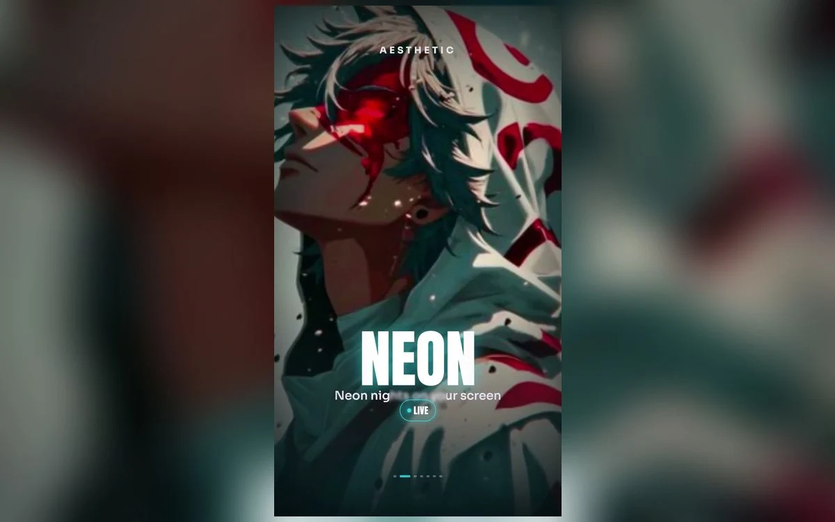
Neon anime art is the easiest style to fall for in a gallery and the easiest to get wrong on a phone. The glow that looks striking at thumbnail size can turn into a haze behind the clock, and the deep blacks that make neon work can go grey the moment the screen dims.
Here is what separates a neon wallpaper that holds up all day from one you replace by the weekend.
Neon works because of the black, not the glow
The colour is not what makes these images read. The contrast is. A magenta line looks electric because the space around it is close to black, and it stops looking electric the moment that space lifts to charcoal.
That has a practical consequence. When you are choosing, look at the darkest part of the image rather than the brightest. If the shadows are already grey in the preview, the glow will be flat on the phone, because a lock screen is usually viewed at lower brightness than a gallery.
It also means neon and OLED are a genuinely good match. On an OLED iPhone, black pixels stay unlit, so the dark areas of a neon image are actually off rather than dark grey. The glow sits on nothing. That is why the same file can look better on a phone than on a laptop.
Where the clock goes
Neon compositions tend to put the light source in the middle, which is the one place that does not cause problems. The trouble is the reflections and the haze above it.
Look at the top third specifically. If there is a bloom or a light streak up there, a white clock will sit in fog. Either pick a piece with a clean dark upper third, or change the clock colour in the editor by tapping the time. On most neon art, white is right, but a coloured clock picked from the image can work when the palette is single-hued.
Avoid anything with text or signage in the top third. Neon art is full of Japanese signage, and a clock over lettering is the fastest way to make a good image look cluttered.
The colour choice matters more than it looks
Blue and cyan neon is the most forgiving. It sits well under a white clock, it does not clash with icon colours on the home screen, and it stays legible when the display dims.
Magenta and purple are the most striking and the least forgiving. They hold attention, which is exactly what you do not want from something you glance at many times a day, and they fight with the reds and oranges in common app icons.
Green is the specialist choice. It reads as terminal-and-circuitry rather than city-at-night, and it works best on the more technical compositions.
If you want a whole set in one colour rather than one image, the dark and AMOLED roundup covers the darker end of the same territory.
Check it once in the dark
Neon wallpapers are chosen in daylight and lived with at night. A piece that looks balanced in a bright room can be genuinely uncomfortable when you check the time at 2am, because the glow is the only thing on screen. Set it, then look at it once in a dark room before deciding you like it. If it makes you squint, it is too bright, whatever it looked like in the gallery.
Live neon, and what iOS will actually play
Neon is one of the few styles where motion adds something real, because the natural movement is a flicker or a pulse rather than character animation.
What iOS gives you is narrower than the previews suggest. Nothing on an iPhone lock screen loops continuously in the background. Motion happens at moments: on wake, on unlock, on tilt. A live neon wallpaper pulses for a second or two and then holds. On Pro models from iPhone 14 onward, the always-on display shows a dimmed static version while the phone sits idle, so nothing plays there.
The home screen has never animated on iPhone, on any version.
The home screen half
Neon is one of the styles where a matching home screen is easy, because blur does something useful with it. In the editor, tap Customise, open the Home Screen panel and choose Blur. A blurred neon image becomes a colour gradient, which is close to ideal behind icons.
If you would rather have a second image, pick a wider, emptier one for the home screen and keep the detailed piece for the lock screen. Icons need space, and neon art is usually busiest in the centre where the app grid sits.
Quick answers
Why does my neon wallpaper look washed out at low brightness?
Because the black is not black. Compressed or upscaled sources lift the shadows, and the lift is invisible at full brightness and obvious at low. Start from a large, clean file rather than a screenshot of one.
Do neon wallpapers use more battery?
A little more than an all-black one, since lit pixels draw power on OLED, but far less than a bright wallpaper. Most of a neon image is unlit black.
Can I match the clock colour to the neon?
Yes. Tap the time in the editor and pick a colour. It works best when the image uses one hue. On multi-colour neon it usually looks better to leave the clock white.
My live version stopped moving.
Check Reduce Motion in Settings, Accessibility, Motion, then Low Power Mode. If both are off, open the picture in Photos and confirm the badge still says Live rather than Off.
Where to get it
Anime Wallpaper 4K – Live has a neon and night section in both still and live form, previewed in a phone-shaped frame so you can see where the clock falls and how dark the shadows really are before you save.
Pick the one with the deepest black, not the brightest glow. It is the same advice every time, and it is the one that decides whether you keep it.