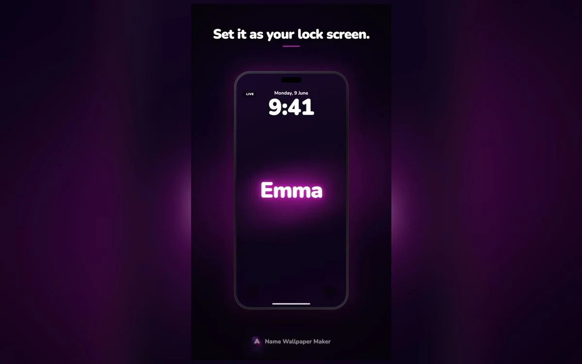
Neon works on a phone for a reason that has nothing to do with fashion. An OLED screen emits light rather than reflecting it, so a glowing letterform on a black ground is not an imitation of neon — it is closer to the real thing than a printed poster could ever be.
That is why a neon name wallpaper looks convincing where a lot of other effects look flat.
Why black backgrounds matter
On an OLED display, black pixels are genuinely switched off. A neon name on a pure black field gets the deepest possible contrast, and the glow appears to come from the letters themselves rather than from a lit rectangle.
It also saves battery, though the effect is smaller than people claim — it is a nice side benefit, not a reason to choose the style.
The practical consequence is that neon and near-black go together. A neon name over a photograph loses most of what makes it work.
Colours that hold up
Not every neon colour survives being small.
Pink and magenta are the most popular and the most forgiving. They stay legible at small sizes and read as warm rather than harsh.
Cyan and mint feel cooler and more technical. They pair well with thin letterforms and badly with heavy ones, where the glow floods the counters.
Purple and violet sit between the two and are the safest choice on a screen you look at in a dark room.
Orange and red are the hardest. They read as warning colours at small sizes and can strain the eyes at night.
Green divides people. Deep emerald works; the classic bright neon green rarely does on a phone.
Glow eats the gaps
The enclosed spaces inside letters — the middle of an a, the loop of an e — fill in as the glow intensity rises. If your name has a lot of them, choose a lighter weight or a lower glow. A name that reads perfectly at full size can turn into an unreadable blob on the always-on display.
Short names and long names
A four-letter name can carry a heavy tube-neon treatment and still breathe. An eight-letter name in the same style becomes a wall of light.
For longer names, thin script or a single-stroke outline keeps the glow readable. For short names, the heavier styles are where the drama is.
If your name has an unusual length either way, try both before deciding — the same style behaves very differently at three letters versus nine.
The always-on display test
This is the check most people skip. iOS dims the lock screen for the always-on display, and a neon wallpaper that looks stunning at full brightness can become a smear at ten percent.
Set the wallpaper, lock the phone, and look at it from across a table. If the name is still legible, the design holds. If it is not, drop the glow or go up a weight.
Beyond plain neon
A few variations are worth knowing.
Neon on a gradient — the glow reads against a soft colour field rather than pure black. Warmer, less clinical.
Outline neon — only the edge of the letter glows. Much more readable for long names.
Double neon — two colours, one for the fill and one for the halo. Effective but easy to overdo.
Neon script — handwriting-style letterforms in tube neon. The closest to a real bar sign, and the most personal-looking.
Matching the neon to your home screen
A neon lock screen sets an expectation, and a default home screen underneath it breaks the effect.
The simplest fix is a matching plain background — the same hue at low saturation, no text. Your icons sit on a coloured field that clearly belongs to the same set, and nothing competes with them.
If you use custom icons or widgets, pull one accent from the neon colour and repeat it there. One repeated colour is enough to tie the two screens together; more than that starts to look themed in the heavy-handed sense.
Neon at different times of day
This is where neon wins and where it occasionally loses.
In a dark room it is unmatched. The glow is the whole point and the black ground disappears entirely, so the name appears to float.
In bright sunlight it struggles. Screen brightness rises, black is no longer truly black, and the glow flattens into a coloured outline. Brighter neon colours — pink, cyan — hold up better here than deep purple or red.
If you spend most of your day outdoors, a higher-contrast style may serve you better than neon, however good it looks at night.
Getting the letterforms right
Real neon is a bent glass tube, and the styles that convince are the ones that respect that constraint.
Tube neon has consistent stroke width — no thick-and-thin contrast, because the tube is one diameter throughout. Letterforms with dramatic weight variation look wrong in neon no matter how well the glow is rendered.
It also has rounded terminals, because tubes are sealed at the ends. Sharp cut-off edges are the giveaway of a glow filter applied to ordinary type rather than a genuine neon design.
You do not need to know any of this to pick a style — but it explains why some neon wallpapers look like real signs and others look like Photoshop.
Quick answers
Does a neon wallpaper drain the battery?
A static image does not run continuously, so the cost is negligible. The dark background of most neon designs actually uses slightly less power on an OLED screen than a bright one.
Which neon colour is most readable?
Pink and violet hold up best at small sizes and in the dark. Bright green and red are the hardest to read.
Will it work with the depth effect?
Often yes — a clear name layer over a dark ground is exactly the kind of separation iOS looks for. It depends on the specific composition.
Can I use a nickname instead?
Of course, and short nicknames usually look better than full names because they leave more room for the letterforms to breathe.
Where to get it
Name Wallpaper Maker: Neon has the neon styles in several colourways, so you can see your own name in each before choosing. Free to start.
Try the shortest version of your name first. It is almost always the one that looks best.