Nothing says "new season" like a fresh wallpaper. The preppy summer look leans into bright pastels, beachy blues, and cute motifs — a bright, happy vibe every time you unlock your phone.
Summer preppy looks to try
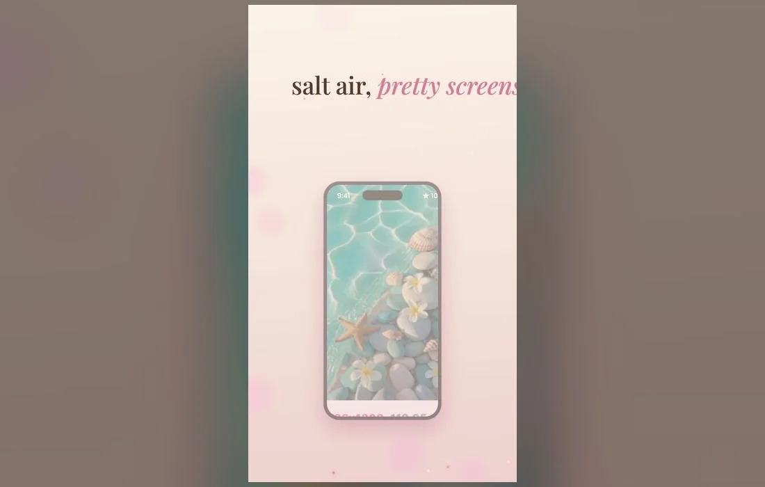
- Beach & salt-air — soft blues, waves and sunny pastel skies. The calmest of the four, and the kindest to notification text.
- Bright pink pop — the classic preppy pink, turned up for summer. Strongest on the Lock Screen, where nothing has to sit on top of it.
- Cute summer motifs — ice cream, shells, sunglasses and smileys. Pick one where the motifs sit low rather than across the clock.
- Moodboard mixes — collage-style wallpapers that pull the whole look together. Busy by nature, so keep the home screen plain if you use one.
Why summer is the best time to refresh
A wallpaper you set in winter rarely fits a bright summer mood. Swapping to lighter, sunnier colors is a tiny change that makes your whole phone feel new — and it takes less than a minute. Think of it as a seasonal reset for your lock screen: brighter palettes, playful motifs, and a vibe that matches long days and warm evenings.
The palettes that actually read as summer
A few color pairings do most of the work:
- Cream, coral and sky blue — the default preppy summer palette, and it stays readable in strong light.
- Aqua and sand — the beach without the literal beach photo. Quiet enough to live behind a full home screen.
- Lemon yellow and white — the brightest option here. Lovely on the Lock Screen, punishing behind dark app icons.
- Watermelon pink and green — playful and instantly summery. Best when the motifs are small and repeated rather than one big graphic.
- Peach into lavender — a sunset gradient, and gradients are the safest wallpapers because nothing competes with your clock.
Build a summer set
- Pick a lock screen with beachy or bright-pink energy.
- Choose a home screen in the same palette so icons stay readable.
- Add matching widgets for a fully coordinated summer look.
- Refresh with a new drop whenever the vibe shifts.
Keep it readable
Summer wallpapers can get busy — keep the top of your lock screen a little calmer so your clock and notifications still stand out.
From the app to your home screen
- Browse the summer styles in Preppy Wallpaper: Pink Cute, preview one full screen, and save it to Photos.
- Go to Settings → Wallpaper → Add New Wallpaper, tap Photos, and choose the one you saved.
- Pinch to zoom and drag so the part you love isn’t hidden behind the clock.
- Tap the time to change the clock font, weight and color — a heavier font is what saves a pale summer design.
- Tap the space under the clock to add widgets. Weather genuinely earns its spot in summer.
- Tap Customize → Home Screen and pick Photo for a sharp background, or Blur to let your icons lead.
Keep it fresh all season
- Rotate weekly with new summer drops.
- Match your widgets to the wallpaper’s colors.
- Save favorites so you can switch back anytime.
- Let iOS do it for you — when you add a wallpaper, choose Photo Shuffle and select a handful of saved summer designs. iOS rotates them on a schedule you set, so the look changes without you touching anything.
Sun, glare and the other summer problems
- You can’t see anything at the pool. Pale pastels have almost no contrast in direct sun. Keep a deeper design as a second Lock Screen and swipe to it outside.
- The clock vanishes into a bright sky. Don’t bin the wallpaper — tap the time while customizing and switch to a darker color or a bolder weight.
- The colors look washed out. Auto-brightness pushes the display hard outdoors, which flattens pastels. Check a design in both places before you commit.
- Photo Shuffle picked a bad crop. Shuffle can’t reframe images. If one keeps landing wrong, set it manually and leave the rest in rotation.
Summer wallpaper questions
What makes a wallpaper look summery rather than just colorful?
Light, warmth and space. Summer designs use bright colors with plenty of white or cream around them, while winter designs go deeper and more saturated. A crowded wallpaper reads as autumn no matter what colors it uses.
Can I set my wallpaper to change automatically?
Yes. Add a new wallpaper and choose Photo Shuffle, pick your favorites, and set the frequency — hourly, daily, on tap or on wake. It’s the easiest way to keep a summer set feeling alive.
Should the lock and home screens use the same image?
Not necessarily, and often better not. Use the bolder design on the Lock Screen and something plainer from the same palette behind your apps, so your icons stay easy to find.
Will these look right on an older iPhone?
Yes. Screen shapes differ a little, so pinch to reposition after you pick one and check nothing important sits behind the clock.
Where to get them
All the summer looks above live inside Preppy Wallpaper: Pink Cute — a free app packed with bright, cute preppy aesthetics, refreshed with new summer drops. Browse, preview and set your favorite in under a minute, and give your iPhone a summer glow-up.