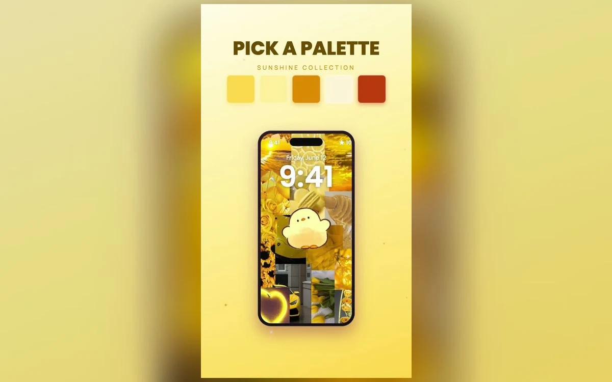
You saved a yellow wallpaper because it looked like a good mood in a thumbnail. Then you set it, went back to the home screen, and two or three app icons quietly disappeared into it.
Yellow is the hardest bright color to live with on a phone. Not because it is a bad color, but because a screen does not treat it the way a wall does.
The answer is not to give it up. It is to know which yellow you are picking, how much screen you hand over to it, and where the darker parts sit.
Why yellow behaves differently on a screen
A painted wall reflects whatever light is in the room. A phone makes its own light and aims it at your face. Yellow already sits near the top of what our eyes read as bright, so a saturated yellow at normal brightness is close to the loudest thing an iPhone can show before it goes white.
That matters because of how you use the phone. You do not admire a lock screen for ten minutes; you see it in short glances through the day. A color that is lovely in a long look can feel like a shove in a short one.
Three yellows, and what each does to your icons
Butter and cream sit high in lightness and low in saturation, closer to off-white than to gold. They keep the warmth while leaving your icons with visible edges, which makes them the safest choice for a full home screen.
Marigold, honey and gold are mid-tones with orange or brown in them. They have depth, and because they are darker than most icon artwork they let pale icons stand out instead of swallowing them.
Lemon and acid yellow are very saturated and very light, with no shadow in them at all. They work as an accent and fail as a full background, because nothing in the image gives your eye a place to rest.
The icon problem, in plain terms
What separates an app icon from a background is a difference in lightness far more than hue. Two things of equal brightness blur together even when their colors are nothing alike, which is why pale icons vanish on cream.
Two ways around it. Pick a wallpaper where the bright yellow lives in the top half and the lower two-thirds drops into amber, brown or shadow, since icons sit low on the screen. Or pick pattern over flat fill: gingham, checks, a painted texture. Pattern gives the eye a boundary, so an icon reads as an object placed on top rather than a shape dissolving into a field.
Setting up a yellow lock screen you can read
Unlock the phone, press and hold the lock screen, then tap Customize. This arrived in iOS 16, and wording shifts between versions. Tap the time to change the font and the color.
On yellow, white is usually the worst clock color offered: it has almost no lightness difference from the background, so the numbers go soft in daylight. Black, dark brown, or a deep version of the wallpaper's accent holds up outdoors and at low brightness. The depth effect, where the clock tucks behind part of the photo, needs a subject with a clear edge, and it can switch off once you add lock screen widgets.
Judge it on your busiest page, not in the preview
The preview shows a wallpaper with nothing on top of it. Set it, open the home screen page with the most apps, and stand near a window. If you can find Settings in about a second, keep it. If your eye has to search the grid, the background is too close in brightness to your icons.
Deciding how much of the screen gets to be yellow
There is a version of this that works and a version that wears you out, and the difference is proportion. A wallpaper that is almost entirely flat yellow gives your eye nowhere to go. One that is mostly cream with a single yellow element, a lemon, a bow, a band across the top, reads as cheerful without shouting.
If you want the saturated version, split the job: bright yellow on the lock screen, where you see it in short bursts with nothing on top but the clock, and a calmer relative on the home screen, such as sand, oat or pale gold. Sunshine sets in Preppy Wallpaper: Pink Cute usually pair the two. One accent color stops yellow reading like a highlighter, whether that is cherry red, sage, or chocolate brown.
Yellow after dark
Warm wallpapers change more between day and night than cool ones do. Night Shift and True Tone shift the screen's color temperature warmer depending on the hour and the room, which nudges lemon toward mustard and cream toward beige. Low brightness pushes it further.
Choose your yellow in the evening, at the brightness you use in bed. If it still looks like the color you wanted then, it will hold up in daylight too.
Quick answers
Does a yellow wallpaper use more battery than a dark one?
On the OLED screens in most recent iPhones, a black pixel is an unlit pixel, so a bright wallpaper keeps more of the panel working than a black one. In normal use that sits well behind screen brightness and screen time. On LCD models such as the iPhone 11, the backlight is always on and wallpaper color makes no difference.
What clock color looks best on a yellow lock screen?
Something clearly darker: black, dark brown, or a deep version of its accent color. White numbers on yellow are hard to read outdoors because the two are close in brightness. Tap the time while editing the lock screen to change font and color.
How do I make my app icons match a yellow wallpaper?
Recent versions of iOS include a tinted icon option in the home screen editing view, which recolors icons to one shade you pick. Which choices appear depends on your iOS version. Tinting works better over a muted wallpaper, since a yellow tint on yellow removes the contrast you need.
Why does my wallpaper look blotchy after I set it?
Usually because the file was a screenshot or a copy re-saved from a chat app rather than the original. Each save compresses the image again, and wide areas of smooth color are where that shows first. Save from the source at full size.
Where to get it
Rather than hunting one down image by image, Preppy Wallpaper: Pink Cute keeps whole sets in warm palettes, butter, honey, sunshine and the cream tones that sit under icons quietly, sized for iPhone screens and free to browse.
Pick two, one bright for the lock screen and one calmer for the home screen, and give them a week before you decide.