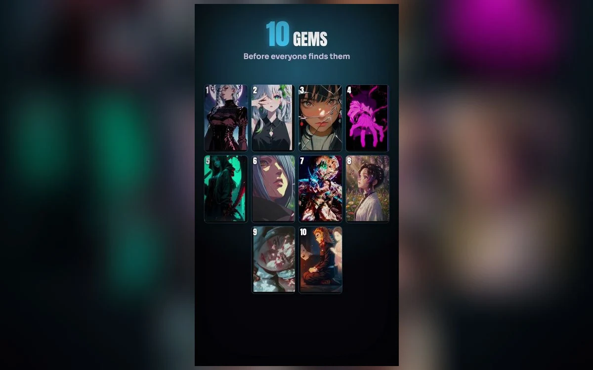
Every anime wallpaper list points at the same dozen images. The most-downloaded Demon Slayer piece, the most-shared Jujutsu Kaisen portrait, the Solo Leveling one everyone has seen. They are popular for a reason, and they are also the reason your lock screen looks like everyone else's.
The better material sits one layer down: original art rather than screen captures, unusual palettes, compositions built for a phone rather than cropped to fit one. Here is how to find it and how to tell the good from the merely obscure.
Why the popular ones are popular
Not a criticism of them. Top images are usually top for real reasons: a strong single subject, high contrast, a face that reads at small size. Those are exactly the qualities a lock screen needs.
So the goal is not to avoid popular art. It is to find images with the same qualities that have not already been set on every phone around you. That means judging by composition rather than by rank.
Four things that mark out a good overlooked image
A dark or empty upper third. Most art is composed for a landscape frame with the subject centred. Anything with deliberate empty space at the top was either drawn for a phone or crops to one cleanly, and it will take the clock without a fight.
One dominant shape. A lock screen gets a one-second glance at arm's length. An image with a single strong silhouette survives that. An image with six small figures does not, however good it is up close.
An unusual palette that is still dark. Teal and rust, deep green and cream, monochrome with one accent. These stand out precisely because the popular pieces are mostly blue-and-orange or purple-and-pink, and they still work because the value range is right.
Native size, not an upscale. The single biggest difference between a professional-looking lock screen and a scruffy one. Fine linework is the first thing scaling destroys, and anime art is mostly fine linework.
Where the obvious sources fall down
Image searches and social feeds mostly return the same recirculated set, resized and recompressed on the way. What arrives is often a copy of a copy: right composition, wrong file. You see it in soft hair edges and blocky gradients in the shadows.
Screenshotting from a video is the other common route and the worst one. Video compression is built to throw away exactly the detail that makes anime art look sharp, and a paused frame keeps none of the original resolution.
Judge the file, not the thumbnail
Every image looks good at thumbnail size, because a thumbnail hides the two faults that matter: soft edges from upscaling and banded gradients from compression. Before you commit to a wallpaper, set it and look at two places on the phone. The edge of the hair, where upscaling shows first, and any large area of smooth colour, where banding shows first. If either looks wrong, no amount of cropping will fix it.
Original art versus screen captures
A frame from an episode is composed for a widescreen shot with dialogue in mind. Cropping it to a portrait phone means throwing away most of the frame and usually the composition with it.
Original illustration, drawn as a still, keeps its balance in portrait. It is also where the unusual work lives, since illustrators are not bound to the scenes that actually aired. This is why a search for a character name returns mostly familiar screencaps, and browsing by mood or colour returns things you have not seen.
If you want a starting point that is not a character name, seasonal wallpaper ideas works by time of year, and aesthetic and lofi works by mood.
The depth effect is a useful filter
There is a practical reason to prefer clean, single-subject art beyond how it looks, and it is that iOS can do something with it.
Depth effect lifts the subject in front of the clock, and it only triggers when the phone can separate a foreground from a background. A portrait against a simple field lifts. A dense collage, a full-frame effect piece or a montage of six characters gives iOS nothing to isolate, and the effect never appears.
So if you set an image and depth does not engage, that is information. It usually means the composition is busier than it looked, which is the same reason it will not read at a glance. Two things also switch it off independently of the image: adding widgets under the clock disables depth on that lock screen, and when the subject covers too much of the time, iOS drops the effect rather than hiding it. The depth effect guide covers both.
Testing one properly before you keep it
Set it, then do three things. Lock the phone and wake it from a normal holding distance, to see whether it reads at a glance. Look at it once in a dark room, since a wallpaper you check at night is a different object from the one you chose in daylight. And open the home screen, to see whether the colour survives the blur.
Anything that passes all three is worth keeping for months. Most images fail at least one, which is why people cycle through wallpapers so quickly.
Quick answers
How do I tell an upscale from a native file?
Zoom in on hair or a hard edge. Upscales soften those lines and often leave a faint halo. Native files stay crisp until you zoom well past full size.
Are live versions of unusual art harder to find?
Generally yes, because animating a still takes work and it gets done for the popular pieces first. If motion matters more than novelty to you, start from the live sets and pick the least-used ones there.
Does an unusual palette clash with app icons?
It can. Blur the home screen rather than using the same image twice, and the colour survives without fighting the icons.
Should I keep more than one and rotate them?
Photo Shuffle will do that for you on a schedule, but it works best with a set that shares a palette. A shuffle across wildly different images makes the phone feel unsettled rather than varied.
Where to get it
Anime Wallpaper 4K – Live is browsable by mood and colour as well as by series, which is what turns up the pieces that character searches never reach, and it previews each one in a phone-shaped frame at full size.
Browse by colour once instead of by series. It is the fastest way to find something nobody around you is using.