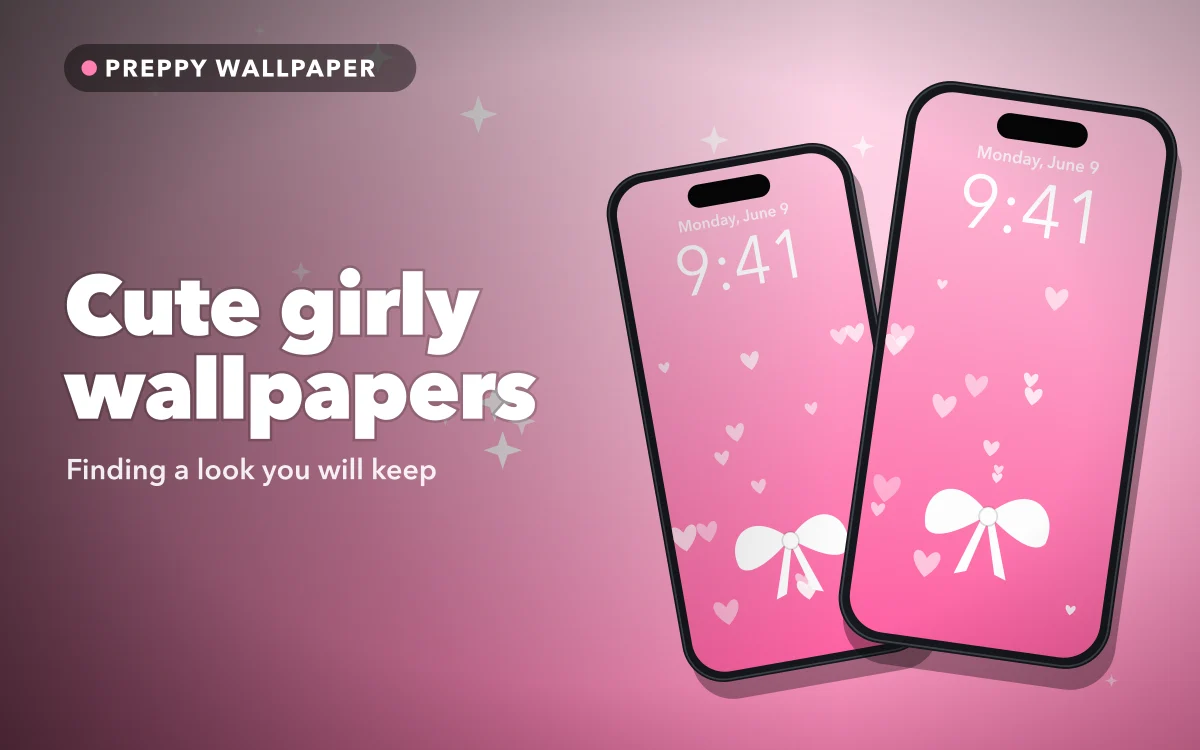
Search for cute girly wallpapers and you will get an almost endless wall of pink. Plenty of it is charming, and nearly all of it looks good as a small thumbnail. The trouble usually starts a few days later, when the wallpaper you loved in a gallery is competing with your clock, your notifications and four rows of app icons.
So it is worth thinking about style first and the individual picture second. Here are six popular styles, how each one behaves on an iPhone, and a simple way to pick one you will not want to replace by next week.
Six styles, and what each is good for
Strawberries and cherries. Fruit patterns are sweet without being too childlike. A repeating strawberry pattern on cream or pale pink looks neat, and small motifs sit easily behind icons. They are one of the more wearable options if you want something cute for the long term.
Bows and ribbons. The signature of the coquette look. One large bow gives you a clear focal point, while small bows work well as a pattern. If this is your style, our guide to coquette and soft girl wallpapers goes much deeper.
Glitter and sparkle. This looks wonderful in a gallery, and it is also the hardest to use. Fine sparkle competes with text, so it works best at the bottom of the screen, or on a Lock Screen with very little on it.
Cute cartoons. Soft kawaii characters and little animals are full of personality. Because they usually have one clear subject, they are often easy to place below the clock.
Soft clouds and gradients. Pastel skies are the calmest option here, and the easiest to live with. They rarely fight with anything on your screen, which also makes them the best choice for a Home Screen.
Hearts and checks. A checkerboard or a simple heart pattern has a clean, graphic look, and it moves easily between cute and preppy. Larger shapes are usually easier on the eye than tiny ones.
Why some wallpapers get old quickly
Most of us look at our phones dozens of times a day, so anything that demands attention can begin to feel loud. A few features tend to wear out quickly:
- Lots of small detail. The eye keeps searching it, and it clutters everything on top of it.
- Text and slogans. Reading the same phrase many times a day stops being fun fairly soon. Our guide to quote wallpapers explains which ones last.
- Very saturated colours. Hot pink over the entire screen can be tiring at night, even though it looks great in daylight.
Simple designs with one idea and plenty of empty space tend to last. If you are unsure, how often to change your wallpaper is a useful read, and changing it regularly is a perfectly good answer too.
Follow along in Preppy Wallpaper: Pink Cute
Free on the App Store for iPhone and iPad.
App Store
A quick way to test a wallpaper
Before settling on a design, try this short test. It only takes a minute, and it saves a lot of saving and deleting.
- Set it on your Lock Screen. Touch and hold the screen, tap Customize, and place the image.
- Look from arm's length. Can you read the time immediately? If not, either move the picture or change the clock colour.
- Wait for a notification. Do your messages remain readable over the design?
- Try it at night. Very bright pink or white can feel harsh in a dark room.
- Check it on the Home Screen. Are your icon labels still easy to read?
If it passes those five checks, you have probably found one that you will keep for a while.
Making the clock work
Most cute wallpapers are pale, which is a problem for a white clock. When you are customising your Lock Screen, tap the time to change its colour. A deep rose, berry or plum usually looks better than pure black against pink, and it still keeps the soft feeling.
It also helps to consider the position of the picture. A large bow or cartoon character should sit below the time, not behind it. With a clear subject, the depth effect may allow part of it to overlap the clock, but this depends on the image and on how you have arranged your screen.
Two wallpapers beat one
If you cannot choose between a bold design and a calm one, use both. Put the bolder picture on your Lock Screen, where nothing but the clock and notifications sit on top of it. Use a plain colour or soft gradient from the same palette on your Home Screen, so your apps stay easy to find. The two screens will still feel like a matching set.
Build a small collection
A good approach is to save a handful of favourites instead of hunting for one perfect image. Your iPhone can store several Lock Screens, so you can swipe between a cute one, a calmer one and a seasonal one without starting again. Our guide to aesthetic Lock Screen ideas has examples, and the best pink wallpapers is a good place to find simple backgrounds.
You might also try a matching set with a friend. Sharing a theme can be more fun than copying the same picture, and matching BFF wallpapers has plenty of ideas for this.
Quick answers
What is the easiest cute wallpaper style to use on an iPhone?
Soft clouds and gradients are the easiest, because they leave your clock and icons readable. Strawberry patterns with small motifs are a close second.
How do I make the clock readable on a pink wallpaper?
Touch and hold your Lock Screen, tap Customize, then tap the time and choose a darker colour. Deep rose or plum usually suits a pink background.
Should I use the same wallpaper on both screens?
You can, but a detailed picture often gets in the way of your icons. Using a plainer image from the same palette on your Home Screen usually looks tidier.
Where to get it
Preppy Wallpaper: Pink Cute describes itself as having more than 1,000 HD wallpapers, with categories that include Cherry and Strawberry, Glitter and Sparkle, Cute Cartoons and Pastel. You can search by aesthetic, mood or colour, and its listing says the wallpapers are free, with no hidden charges.
Choose the one that still looks good with your apps on top of it.