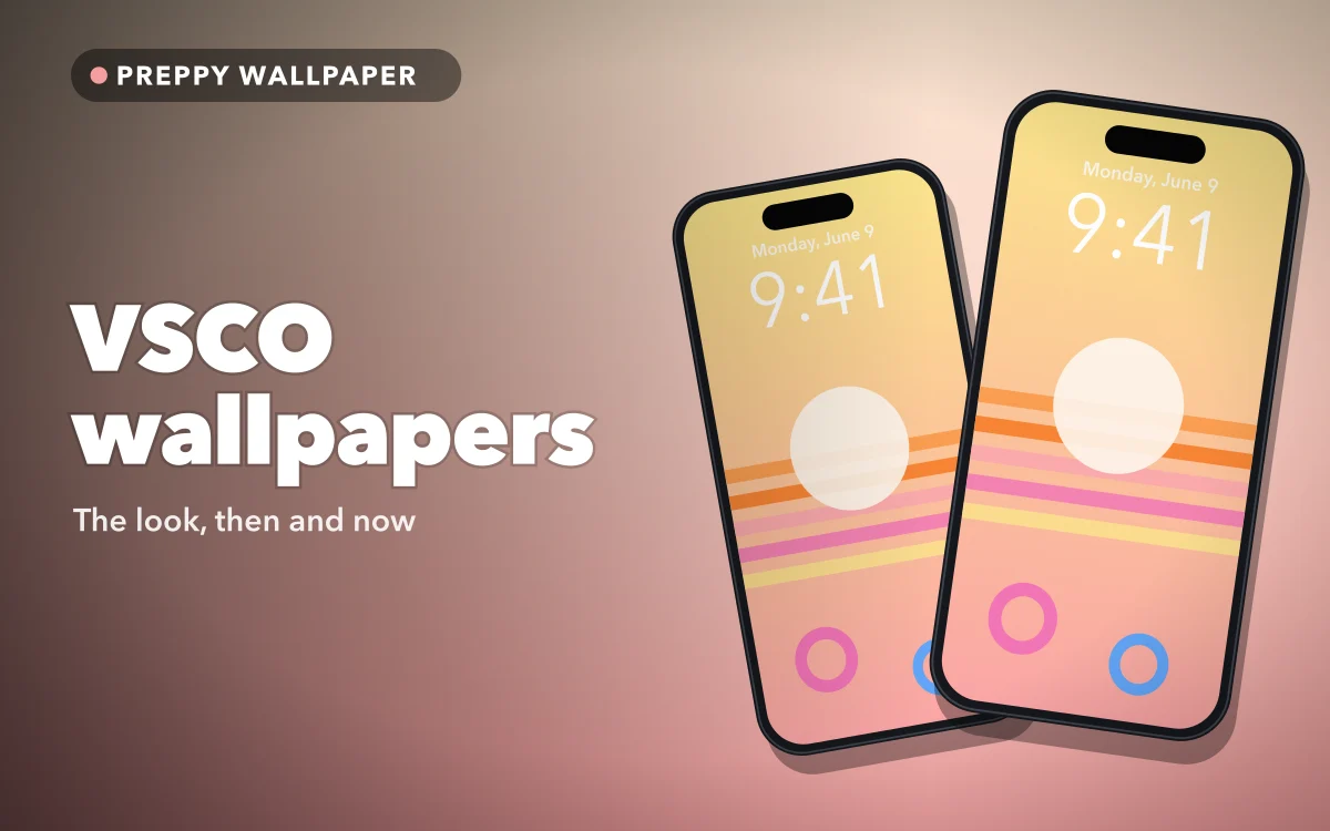
Search for a VSCO wallpaper and you get a very particular kind of picture: a sunset over water, a faded beach, a sky the colour of peach sorbet, everything slightly washed out as if it had been shot on old film. The look has not really gone anywhere. It has just changed its name a few times.
What survived is the finish rather than the outfit, and that same faded finish is what makes a white lock screen clock disappear.
Where the VSCO look came from
VSCO is a photo-editing app, and long before its name became an adjective, it was known for film-style presets: filters that lift the shadows, soften the contrast and tint the image warm or cool, so a phone photo looks more like film.
In summer 2019 the phrase "VSCO girl" spread quickly, largely through parody videos on TikTok. The stereotype was very specific: scrunchies on the wrist, oversized or pastel tees, a reusable water bottle, metal straws, a shell necklace, and the catchphrases "sksksk" and "and I oop". VSCO the company said it did not start the trend. The name simply came from the app so many of those photos had passed through.
The clothes and catchphrases dated quickly. The photography did not.
What a VSCO wallpaper actually looks like
A VSCO wallpaper is defined more by its finish than its subject. Beaches, sunsets, palm trees, shells on sand and film-style collages are all familiar, but what makes them read as VSCO is the treatment.
- Lifted blacks. The darkest areas are soft grey or brown rather than true black. This is the biggest tell.
- Low contrast. Nothing is harsh, and highlights are creamy rather than bright white.
- A warm or pastel cast. Peach, coral, butter yellow and faded sky blue, not saturated primaries.
- Natural light. Golden hour, an overcast beach, late afternoon, often with a little grain.
Its neighbours are easy to tell apart. Y2K wallpapers are glossier and more graphic, and coquette and soft girl lean on bows, lace and blush tones. VSCO is the one that looks like a holiday photo.
Follow along in Preppy Wallpaper: Pink Cute
Free on the App Store for iPhone and iPad.
App Store
How VSCO turned into today's preppy
The look did not disappear after 2019 so much as split in two. One branch softened into the pastel, beachy style: dreamier, quieter, less about the props and more about the colour. The other got louder.
That louder branch is what most people now call preppy. The beach and the brightness survived, but the faded film finish gave way to saturated pinks, smiley faces, chequerboard patterns and bold lettering. Where a VSCO wallpaper is turned down, a preppy pink wallpaper is turned all the way up. The family resemblance is clearest in summer preppy wallpapers, which go back to sunsets, palms and ocean blues.
If you are not sure which you want, look at the darkest part of the image. Faded and greyish means VSCO. Clean and saturated means preppy.
Faded film tones and the lock screen clock
This is where the aesthetic and the iPhone disagree. The lock screen clock is often white on photo wallpapers, and a faded wallpaper is, almost by definition, made of pale mid-tones. A white clock over a washed-out peach sky does not stand out; it sinks into it. Large, thin clock fonts suffer most.
You rarely need a different wallpaper. You need a different clock colour.
- Long-press the lock screen and tap Customize.
- If iOS asks which screen to edit, choose the lock screen.
- Tap the time.
- Pick a colour from the row of swatches, or choose your own shade. If your iOS version offers a translucent glass clock, switching to the solid style keeps a deeper colour easier to read.
While you are in the editor, pinch and drag the image. A sunset with the horizon in the lower half usually puts the deeper sky behind the time.
Borrow the clock colour from the photo
Faded wallpapers are mostly pale mid-tones, so a white clock sinks into them, and a black one stays readable but looks harsh against the soft finish. The deepest tone in the image itself, such as a dusty coral or a sea blue, usually keeps the time legible without breaking the soft look. If the clock still disappears, the crop is the problem: move a calmer area behind it.
Making it a lock and home screen set
A VSCO set works best when the lock screen carries the photograph and the home screen carries the colour. Icons and labels turn a detailed sunset into clutter, so the busiest picture belongs on the lock screen, where only the clock and widgets sit over it.
Three pairings that hold up:
- Sunset and sky. The full sunset on the lock screen, a close crop of just the pink-to-orange sky behind the icons.
- Beach and sand. Waves on the lock screen, a plain warm sand or faded peach on the home screen.
- Collage and colour. A film-style collage on the lock screen, one faded pastel from it on the home screen.
Pale wallpapers make white icon labels harder to read, the same trade-off covered in pastel wallpapers that keep icons readable. On iOS 18 and later, tinting the app icons to a matching shade ties the pair together. Matching lock and home screen sets has more ideas.
Finding the look when nothing says VSCO
An honest note, since this is our own app: Preppy Wallpaper: Pink Cute has no category called VSCO, and it has no connection to the VSCO company. The look sits across categories with other names.
- Pastel is the soft, dreamy side and the closest match for the faded palette.
- Aesthetic is the Pinterest-style, minimal category.
- Preppy Pink is where the louder descendant lives.
- Y2K is the glossier cousin.
Its search works by aesthetic, mood or colour, so try a colour such as peach, or a mood, rather than the brand name. Saving favourites as you browse makes the pair easier to assemble later.
Quick answers
Is the VSCO girl look still a thing?
The 2019 version, with the scrunchies and catchphrases, is mostly remembered rather than worn. The photography style behind it is very much alive in pastel and beach wallpapers. If you are here for a wallpaper, it is the look you want, not the outfit.
Is this wallpaper app made by VSCO?
No. VSCO is a separate photo-editing app and company, and Preppy Wallpaper: Pink Cute has no partnership with or endorsement from it. Here the word describes an aesthetic, nothing more.
What is the difference between VSCO and preppy?
Mostly the finish. VSCO is faded, low-contrast and warm, with soft greys where the blacks would be. Preppy is bright, saturated and graphic, usually pink, often with smiley faces and checks.
Can I turn my own photo into a VSCO-style wallpaper?
Yes, but in a photo editor; the wallpaper app does not edit or filter your own photos. In the Photos app, lowering the contrast, lifting the shadows and adding a little warmth gets you most of the way. The photo filters guide explains what fade and film filters actually do.
Where to get it
Preppy Wallpaper: Pink Cute has HD pastel, aesthetic and preppy wallpapers you can set on the lock screen, the home screen or both, with search by aesthetic, mood or colour.
Whatever you choose, change the clock colour before deciding a faded wallpaper does not work.