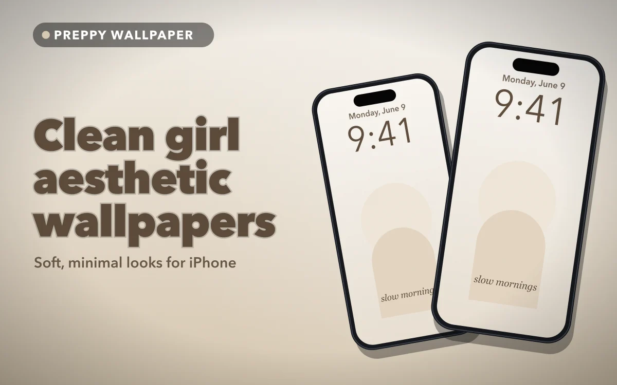
"Clean girl" began as a beauty and style label for a polished, effortless-looking style: minimal make-up, neat hair, gold jewellery, neutral clothes. As a clean girl aesthetic wallpaper it becomes cream, beige and soft brown, and a screen that feels calm rather than busy.
The catch is that these are also the colours iOS handles worst. A white clock on cream, white app names on beige: the more neutral the wallpaper, the more of your screen quietly disappears. Getting the look right is mostly a contrast problem, and it is an easy one to fix.
What makes a clean girl aesthetic wallpaper
A warm, narrow palette. Cream, oat, sand, taupe and mocha, with warm white and perhaps a touch of gold. Cool greys and stark white belong to a colder kind of minimalism.
Softness. Gentle light, folds of fabric, out-of-focus shapes.
Restraint. One subject at most, such as a shadow across a wall or a ceramic cup, with plenty of empty space around it.
It sits close to old money, which shares the polish but leans on navy, green and heritage patterns. What separates clean girl is the warmth and the near-total absence of pattern.
The neutral palette, and why it is harder than it looks
Neutrals feel safe because nothing clashes. The trouble is that nothing contrasts either.
The lock screen clock usually starts out white or pale unless you change it, and the app names on the home screen are white too. White on a typical cream works out at a contrast ratio of roughly 1.2 to 1. The common accessibility guideline for large text, which a clock certainly is, asks for 3 to 1.
The darker end behaves differently. White on a mid taupe sits around the 3 to 1 line, and on a deep mocha it clears that line comfortably. The palest shades, which look cleanest in a thumbnail, are the riskiest.
Think in named shades rather than "beige": cream and oat at the light end, latte and taupe in the middle, mocha and espresso at the dark end. Pick one light and one darker version of the same tone, and save both.
Follow along in Preppy Wallpaper: Pink Cute
Free on the App Store for iPhone and iPad.
App Store
Texture over pattern: linen, soft shadow and plain gradients
On a neutral wallpaper, detail has to come from somewhere, or the screen reads as a blank rectangle.
Pattern, meaning checks, grids, stripes or repeated florals, adds hard edges at regular intervals. On a home screen those edges run straight through your icons, and in a palette this pale they make labels even harder to pick out.
Texture adds depth without edges: linen weave, paper grain, plaster, the soft shadow of a window frame, a gradient drifting from cream to sand. The screen feels finished, but nothing competes with what sits on top.
Texture also hides a technical flaw. A smooth gradient across a narrow colour range can show visible steps, called banding, especially after compression. A little grain breaks them up, so a slightly textured version usually looks smoother on the phone than a perfectly flat one.
The clock problem on cream and beige
Change the clock, not the wallpaper. Long-press the lock screen, tap Customize (pick the lock screen if iOS asks), then tap the time. Choose a dark, warm colour: espresso, deep taupe or near-black, and pick the solid rather than the glass finish if your iOS version offers both.
Pure black works, but a deep brown keeps the warmth and still clears the guideline easily. The same panel changes the font, and a thin typeface loses more on a pale background than a heavier one.
A plain top third also helps: a subject behind the time fights it whatever colour you choose. Aesthetic lock screen ideas has more on arranging that space.
The arm's-length test
Set the wallpaper, lock the phone and hold it at arm's length, once indoors and once near a window. If the time fades before the picture does, the contrast is too low. A pale wallpaper that looks fine on the sofa can wash out completely in daylight.
A home screen that stays clean
App names have the same problem, and the clock fix does not reach them; the pastel wallpaper guide explains why iOS keeps them light. Two changes help.
First, use a slightly deeper shade behind your apps: cream with an espresso clock on the lock screen, latte or taupe on the home screen. The two still read as a set, and the labels gain contrast. Matching lock and home screen sets and why the two screens need different things cover the pairing.
Second, match the icons. Long-press the Home Screen, tap Edit, then Customize. iOS 26 offers four styles:
- Default keeps every app's own colours, the quickest way to break a neutral palette.
- Dark puts icons on black. Very readable on cream, but heavy.
- Clear, new in iOS 26, turns icons into glass that lets the wallpaper show through. The most minimal option, and the least legible on a pale background.
- Tinted washes every icon in one colour. Set it to a warm brown that matches the wallpaper and the screen looks deliberate.
Dark and Tinted arrived in iOS 18. The same panel can also make icons larger, which removes the app names altogether.
Keep the layout to a few icons and one or two widgets. The full home screen build goes through it step by step, and the widget guide covers which widgets earn their space.
When clean turns into blank
Push it too far and calm becomes unfinished: an all-cream wallpaper, Clear icons, hidden labels, no widgets. It photographs well and is irritating to use. You have gone too far when you keep opening the wrong app.
The fix is a single anchor: one soft shadow, one object or a quiet initial. Minimalist name wallpapers show how little that needs to be. If beige starts to feel flat, a step towards butter yellow keeps the softness with more light in it, as the sunshine yellow guide shows.
Quick answers
Why does my clock disappear on a beige wallpaper?
Because it is usually white or pale, and either has almost no contrast on light beige. Long-press the lock screen, tap Customize, tap the time and choose a dark brown or black.
What is the difference between clean girl and minimalist wallpapers?
Minimalism is about reduction and can be any colour, often stark black and white. Clean girl is a specific warm palette of cream, beige and soft brown, with texture and gentle light.
Which app icon style suits a clean girl home screen?
Tinted in a warm brown is the most balanced. Clear looks the most minimal but is hardest to read on pale wallpapers; Dark is the most readable but the heaviest.
Can a clean girl wallpaper still have some pink in it?
Yes, if it is a dusty or blush pink with low saturation, which behaves like another neutral. Bright pink, bows and hearts move it towards coquette and soft girl instead.
Where to get it
Preppy Wallpaper: Pink Cute has a Clean Girl category of minimal, neutral HD wallpapers, with search by aesthetic, mood or colour, favourites for keeping a light and a darker pick together, a Trending tab, and setup for the lock screen, the home screen or both.
Choose the wallpaper for how it looks, then the clock colour for how it reads.